
 How to resolve AdBlock issue?
 A Deep Dive into Opt-Out Activity

Back in 2021, I wrote an article for Only Influencers sharing data from OPTIZMO’s annual Email Opt-Out Infographic. That infographic covered data from 2018-2020, so it culminated with a look at how a year of the COVID-19 pandemic influenced email opt-out behavior. (Is it just me or is it hard to remember exactly what year the pandemic happened? Part of my brain has put it far behind us, but in reality, it was officially declared to be over less than 2 years ago.) While we’ve continued publishing our annual infographics each year, I hadn’t written about what those post-pandemic years showed. So, did email recipient behavior return to pre-pandemic ‘normal’ or were some of the changes more long-lasting? Let’s take a look.
Before we dive in, some email marketers may wonder - why focus on negative marketing signals like opt-outs? “These are people who I can’t market to anymore, so I just want to get them off my list and move on.” It’s a natural thought process, but I think it needs to be reassessed. When we are evaluating campaigns and working on ways to optimize performance, we typically focus on our KPIs like open rate (maybe not so much anymore), click rate, conversions/sales, revenue, etc. These are the metrics we’re trying to improve, so that’s where we tend to focus first. However, all of our negative marketing metrics (opt-outs, spam complaints, non-responders, etc.) are equally as important to analyze. Sometimes the best way to improve response is to understand why some recipients either ignore your emails or don’t want to receive them. Learning about what is turning some people off can be every bit as valuable as knowing what gets others to engage. If that concept sounds interesting, I’ll be speaking about the value of negative marketing signals to optimize your email campaigns during Email Innovations World in June (save 15% on registration with code ‘ONLYINFLUENCERS’)!
When we analyze the hundreds of millions of opt-out requests we process each year, we tend to look at them in a few categories.
- WHERE opt-outs are coming from (Geography and Email Domain)
- WHEN opt-outs are received (Month, Weekday, and Time of Day)
- WHAT technology was involved with those opt-outs (Device Type, Browser, Operating System)
Quick note - our latest infographic comes out in a few weeks, so all this data is a bit of a sneak peek.
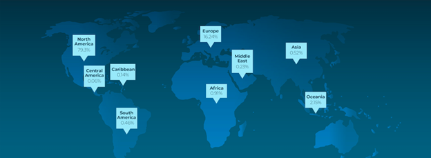
Where Opt-Outs Come From
In our analysis, we first look at Where opt-out requests are coming from based on physical location. The majority of our clients are in the US, but many market to other countries as well. Still, the majority of opt-out requests we process each year come from the US. Interestingly, we saw a significant uptick in non-US activity in our systems in 2023 compared to prior years. This follows a trend we are seeing with the % of international email opt-out activity rising every year since 2019. The main driver of this increase is from European countries. However, this trend may have more to do with the unique makeup of our client base, rather than an actual industry trend. So, let’s consider some data that should be more applicable across the industry.
Another way we evaluate Where emails come from is to look at the email domains attached to those opt-out requests. We all know that reaching the inboxes of various email providers is a constant challenge. Each year major email inbox providers change the ways they determine which emails to deliver to the inbox (primary, promotions, or social, etc.) vs. the spam folder keeping email marketers on their toes and adapting to new requirements like those put in place by Gmail and Yahoo! this year. Watching how the percentages of opt-outs we process from different email domains each year can be a good indicator of how successful marketers are at meeting new requirements and reaching recipient inboxes.
When we began analyzing data for these infographics (2018), Yahoo! clearly dominated the field accounting for over 37% of opt-outs. That year, Gmail came in at only 16%. However, Gmail’s percentage increased yearly through 2022 when it topped 30%, unseating Yahoo! for the top spot on our list. However, in 2023 we saw a reversal where Yahoo! reclaimed the top spot and Gmail dropped to its lowest level since 2019.
We’ll be extremely interested to look at this data again next year, as we can analyze the impact of the Gmail/Yahoo! changes on opt-out activity. It won’t be surprising if we see a drop in both percentages in relation to all the other domains out there. For context, we typically receive opt-out requests from up to 1 million different email domains, with the vast majority coming from the top 10.
When Opt-Outs Happen
Next up in our analysis is a look at When opt-outs occur. We look at the data from a monthly, weekly, weekday, and hour-of-day perspective.
While monthly data can be impacted by large seasonal campaigns, most months remain relatively consistent year-over-year going back to 2020. Drilling down to activity by weekday starts delivering more actionable insights.
Since 2018, Monday has been the most active day for email opt-out requests, other than 2023 where Thursday spiked because one of the major inbox providers had an issue with their spam filters failing on that day, causing a massive influx of emails to reach their recipient inboxes, which in turn led to a massive increase in opt-out activity. When that day was normalized in our data, Monday once again took the top spot. What we typically see in a normal year is that opt-outs are highest on Monday and then slowly decrease through Saturday.
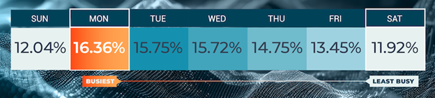
From a mailing standpoint, this data has backed up the commonly held idea that Monday was a ‘bad’ day to send out marketing emails. However, this data can be looked at another way. On Monday, recipients are actively curating their inboxes, engaging with some emails, deleting others, and opting out of those they no longer wish to receive. If you are delivering engaging email content, then Monday may be a great day to mail, since your recipients are more likely to be looking at their inboxes. If your email stands out, why not send it when recipients are most likely to see it? It certainly suggests that simply accepting that old conventional wisdom without testing it may not be the best choice.
Following on the heels of weekday, looking at opt-out activity by hour of the day is another good way to identify when recipients are most likely to be actively working on their inboxes. Since 2018, we have seen the most active hour shift slightly, but remaining in a 3-hour window of 9am-11am Central Time. Along with this, we have seen a predictable daily activity curve pick up in the early morning, top out mid-morning, and then slowly drop through the afternoon and evening hours. However, looking at the curve year-over-year, we see a gradual flattening occurring where the most active hours have less activity and the lowest activity hours have more.
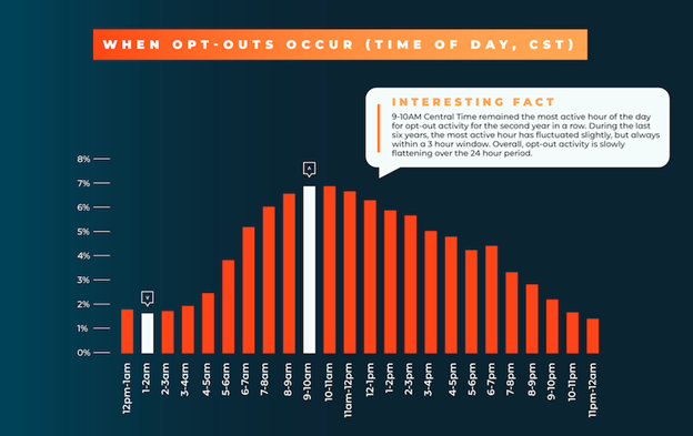
Similar to the weekday data, this hourly activity trend can help you identify the optimal hours to send your campaigns. Of course, you’ll want to test, because your recipients may behave differently than this large aggregate group. However, this data can give you some guidance on what hours to start with in your testing.
What Technology Consumers Use to Opt-Out
Last up, we dive into the technology involved in opt-out activity. What we find most interesting here is looking at activity by device type. We are all aware that from the advent of the smartphone forward, Mobile devices took on a larger and larger percentage of browsing activity each year until they eventually superseded Desktops as the primary driver of online activity. Not surprisingly, opt-out activity followed a similar trend. However, the pandemic turned this trend on its head in 2020, where Desktop activity grew, as people dramatically reduced their time out of the house. Following the pandemic, we wondered if the trend would flip back, as the world opened back up.
2021 showed an uptick in Mobile opt-out activity, but interestingly 2022 showed a slight drop. However, with 2023 data to evaluate, the trend is back up for Mobile, reaching its highest percentage of opt-out activity since before the pandemic. However, it still hasn’t reached those pre-pandemic levels, possibly because a larger percentage of people are now working from home permanently.
Conclusions
When the pandemic came to an end it was reasonable to wonder if people would largely return to their prior habits. As we get further from the pandemic it’s safe to say that it had long-term impacts on how people interact with their inboxes, along with larger societal shifts like permanent remote work.
 Photo by Junseong Lee on Unsplash
About the author
 Tom Wozniak is the head of Marketing and PR for OPTIZMO Technologies, delivering the industry’s most powerful platform for email compliance and suppression list management to clients throughout the U.S. and around the world.
Tom has over 20 years of experience in email, affiliate, and various other digital marketing channels. Prior to OPTIZMO, he was VP of Marketing at SpotX, headed up marketing at Media Breakaway, and held senior leadership roles with Trueffect and NextAction, among other companies. He regularly writes for several industry publications and speaks at various affiliate and email marketing industry events.