Converting Web Visitors into Subscribers
"At FierceMarkets, a digital B2B publishing company, anywhere from 30%-80% of our email newsletter list growth comes from converting web visitors into subscribers. In this article, I’ll share what’s working for us, and hopefully you’ll be able to apply it to your organization."
One of the most productive places to capture email addresses is on your company’s website. People who are browsing your products and information are demonstrating their interest, so you want to make it easy for them to sign up for your newsletter or email list while they’re engaged.
At FierceMarkets, a digital B2B publishing company, anywhere from 30%-80% of our email newsletter list growth comes from converting web visitors into subscribers. In this article, I’ll share what’s working for us, and hopefully you’ll be able to apply it to your organization.
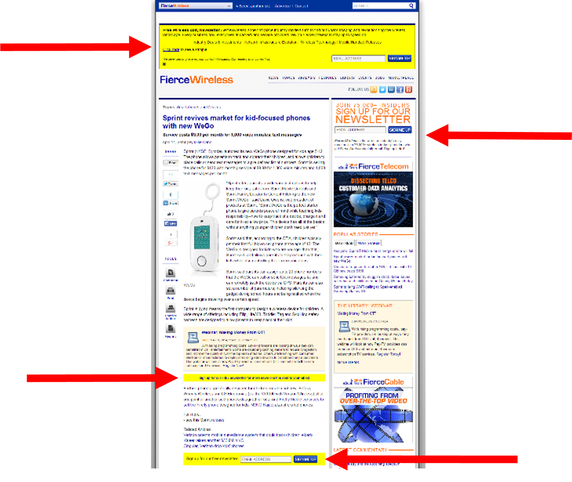
 If you visit one of our publication websites, you’ll probably quickly notice the number of subscribe ads we have on the page to promote our email newsletters. We have no less than four signup areas on each of our content pages, and we sometimes push it to five.
We want to make sure that we can convert a visitor into a subscriber at every point in his or her journey down the page. Starting from the top, we have two signup ads near the headline, in case reading the headline is all it takes to convert someone.
We refer to the yellow box at the very top of our site as a signup pusher because it pushes the content down as it expands. If you visit one of our websites, like FierceWireless, you’ll see the push-down functionality. We have a few different formats and language templates across our sites, but there’s always a box where people can enter their email addresses to subscribe to the newsletter.
When web visitors enter their email address in the text box and click the “Sign Me Up” button, we subscribe them to the publication and direct them to a page that asks for additional demographics. Even if that person doesn’t fill out the additional demographics, they’re still subscribed to the newsletter. On average, 72% of people end up filling out the additional demographics on the second page.
The signup pusher is a bit invasive, so don’t show it to any current subscribers who are browsing the websites. We also have an option for non-subscribers to snooze the pusher for seven days if they’d just like to browse the website and not subscribe to the newsletter.
The second ad from the top of the page is a static signup box that sits in the top right corner of each of the pages of our websites. It also has a text box for people to enter their email addresses, and it works the same way as the signup pushers – we immediately sign someone up for the newsletter once we receive their email address and direct them to another page with additional demographics to fill out.
In case folks need a little more information than just the headline and first paragraph of an article to decide they want to sign up for a newsletter, we also include a one-line signup link in the middle of the article. This links to a page with additional information about the publication and a full demographics form.
For those web visitors who read the whole news article, we place a signup ad after the content for one last chance to convert them into newsletter subscribers. This ad has the email address text box and works like the signup pusher and signup box where the person is subscribed after he or she clicks “Sign Me Up” and is then directed to a page that asks for additional demographics.

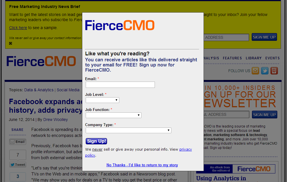
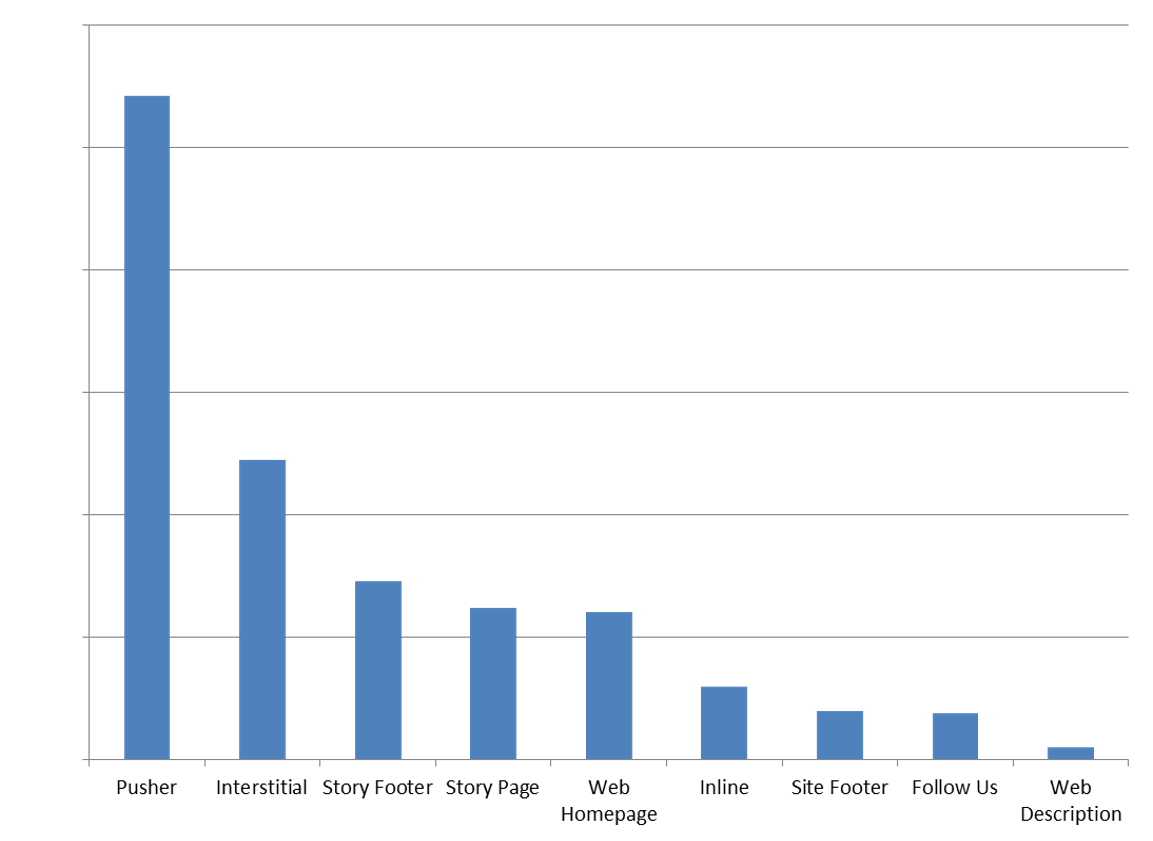
So, the question remains: How effective are these ads? Many people would imagine that the more invasive as like the signup pushers and the interstitials would be more annoying than effective. However, the opposite is actually the case. As you can see below, the signup pushers and the interstitials actually have the highest conversion rates.
Conversion Rate by Signup Ad

As with so many other tactics in the email marketing world, the key is to test what works with your audience. Make sure to balance invasiveness with effectiveness, but let the data – instead of your gut – guide you.

 How to resolve AdBlock issue?