Dark Mode – a new layer of render complexity
Once upon a time we could test, learn, and implement without fear or bias. Knowing that our emails would look different for each reader, but happy to work with the majority view. This is no longer the case as this example highlights. Help wanted on what you’ve found, changed and decided on, in an email world of increasing Dark Mode uncertainty.
How many times in your email career have you had to disappoint a design colleague, when letting them know that their perfect use of layout, font and drop shadow will be compromised once the actual email hits the multitude of devices, email clients and web browser variations.
Now things are getting even more tricky with the advent of Dark Mode. The devise option to inverse colour schemes, which in most cases creates dark backgrounds and light content elements such as your email copy.
BUT dark mode doesn’t impact on all elements of your content e.g. image files. So suddenly there is a whole new set of render minefields to navigate across light and dark versions of the same email.
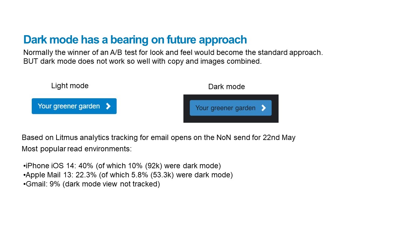
Dark mode may not be the majority view environment for your audience (I would check this with some analytics tracking) But there will be enough readers using this view to make it a design consideration. For my client 15% of iPhone and Apple client users were reading in Dark Mode. This is over 150,000 opens. Each a reader experience to be mindful of.
Even more tricky for us is that tried and tested design approaches are now being compromised from a look and feel perspective. No longer allowing non bias, data led, A/B testing result decisions to define the approach. Here’s an example for consideration. And I would love any further examples and responses on how you’ve made the final content approach choices.
Ignoring Dark Mode for a moment.
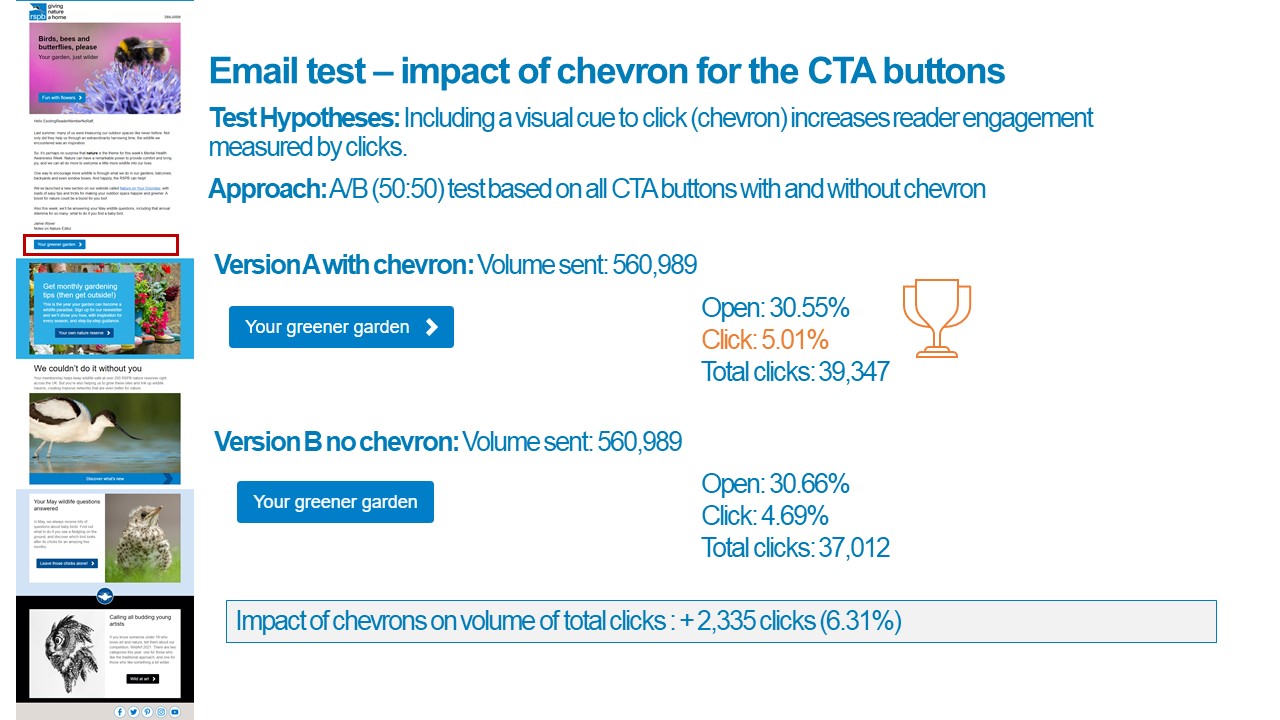
We tested the impact of a chevron > (added as an image) to all CTA buttons in an email. Without doubt this had a positive impact. A 6% increase in overall clicks from a straight A/B test.

Bring Dark mode back into the mix.
As the chevron is an image, in Dark Mode this does not invert its colour along with the copy. So you now get a design mismatch – and hence poor user experience. It makes your email look ‘wrong’.

So, what do we do? Let the impact of the A/B test lead the content approach? Or remove the risk of a poorer user experience by removing the chevron (as we can’t control the render) but potentially reducing email click rate performance.
At the moment we’re seeing if our design team can come up with a set of new options. Its probably not the chevron itself that drives clicks, but visual engagement with the button. So how else can we create that, without causing more Dark Mode issues.
What would you do? Are you currently wrestling with Dark Mode compromises? Is the click worth more than the experience of the minority?
Answers on a postcard (at least print has a fixed render)

Cover Photo by Alexander Andrews on Unsplash

 How to resolve AdBlock issue?
