Do you get a second chance to make a first impression?
The importance of setting a first impression
Setting first impressions in email marketing begins with the first email a subscriber receives after entering their email address in your signup form. That newly excited subscriber eager to receive your organisation's emails has expressed an interest; they want to learn more. So, how do we ensure, as email marketers, that we are making a great first impression? In this blog, I will explore the welcome email journey and the common pitfalls organisations face. Let’s see how we overcome those pitfalls with the examples below.
The inspiration for this blog came from a recent teaching experience. For the past three weeks, I have been teaching degree and master's students in Bangkok at Harbour.Space University about data-driven email marketing. Our primary focus for the module is on the welcome email marketing journey. I hear you ask why because it is the most critical automated email marketing journey an organisation will ever take. Why? Because it is the first email your new subscribers and potential new customers will receive from your organisation. This email journey sets that first impression. We can make a great first impression or a bad one, and from my experience, it can make or break the rest of your email marketing activity.
Let's see how below.
Where do we set a first impression in email?
For a new email subscriber, the signup option is the first impression of our email marketing programme. The information we collect, the positioning of the signup form on the website, the design and the initial introduction all play a part in creating the first impression. The best rule of thumb here is that less is more. Only capture the data that we intend to use, and typically, for a newsletter subscription, the email address is enough at the very first step. More information about the subscriber can be captured in the welcome email journey, and we'll look at examples of how to do this below, rather than creating a barrier to a new recipient subscribing with an overly long and complicated signup form.
Impressions made in the inbox
Once the first email after subscribing lands in the inbox, the sender name, the subject line, and the preview text (or super subject line) all work towards building upon the first impressions. If your subscribers open their emails in Gmail, for example, display the logo when BIMI verification has been completed and add further confirmation that the email is really from your organisation.
If the logo doesn't display and this is the first email we receive as a new subscriber, do we trust it? Is the email really from that organisation? Think of it this way. You're about to meet someone new for the first time, and you only have their profile picture to recognise who they are. However, the profile picture doesn't look like them, and upon meeting the new person, you're still determining if it is the same person. Is this starting a new friendship off in the best way? Not really, with a lack of trust and doubt. The same happens in the inbox. We don't want to start creating doubt in our subscriber's minds because they have a blank profile and a lack of logo and identity to confirm that the email is one to trust.
And BIMI isn't the only verification needed. DMARC, DKIM and SPF shouldn't be seen as nice to have's they are essential and have always been essential. The verification of your email domain instils trust with your subscribers and protects your organisation's domain. Confirming an organisation's email domain is theirs and that they own it should be a step that is taken as part of the set-up of your email marketing infrastructure; that's how it works for websites, and the same applies to email.
Opening the envelope
Once the new subscriber is engaged enough to open the email they are typically greeted with an automated welcome email. As the recipient opens the email, the impressions continue to be developed. Some key areas to consider here to invoke a positive first impression:
- Is it relevant to the new subscriber?
- Is it valuable? Or useful?
- Does the email render correctly?
- Do the links work?
- Is the messaging and content consistent with the brand values and with other channels such as the website?
This first email could be a double opt-in like this from Nuud:
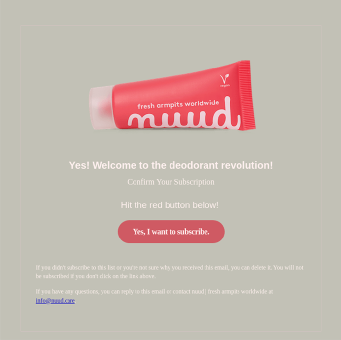
This email aims to confirm with the person that they want to continue to subscribe. Nuud does a great job of this here with a clear and straightforward email design. It doesn’t contain any other information or distractions; it is direct and transparent to the recipient the action they are being asked to take with the one CTA: ‘Yes, I want to subscribe’.
Afterwards (or this could be the first email if double-opt-in isn’t being used), there is a follow-up email, typically with a welcome and thank you message to confirm the new subscription. Similar to this example here from Patagonia:

A welcome email also provides the opportunity to thank a new subscriber for signing up, start building upon the awareness of the organisation's brand values and offerings, and find out more about their new subscriber. In both scenarios, the email doesn't have to look automated. It can and should include your organisation's branding and logo, as demonstrated by the Nuud example above.
However, sometimes, an automated email looks robotic and scheduled. It needs branding and consistent messaging and provides limited value to the new subscriber. For example, I received this from a globally recognised brand only a week ago!
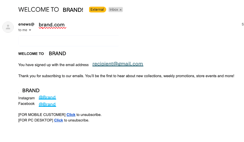
Having worked in marketing for 10+ years, there's little that shocks me apart from this. This example shocked me. It's 2024. It is the year of AI, and yet email marketing that looks like this is still being sent. My students asked me, "Why does the email look like this? I didn't even believe it was really from the brand!" There are few excuses with the vast amounts of technology available in email marketing and the array of pre-built templates available. Limited resources remain a challenge, but first impressions count for the most essential email marketing journey.
Okay, so what else is missing here? Trust. With the increasing levels of spam, which is now even prompting the mailbox providers to take actions into their own hands. Spam is becoming increasingly sophisticated and could look more like it comes from the brand than this email. I received an email only last week from a highly recognised brand I frequently use to run my agency; it even looked like it came from them and used an incredibly similar domain, but it wasn’t the organisation I use. It was a spammer pretending to be that organisation. This area should be a top priority for all organisations because the risk to your subscribers and reputation damage to an organisation is high. Again, we want our emails to reflect our organisation’s brand and to look like they were sent from us, no matter the system used to send the email.
Clicking for more
This impression continues when a subscriber clicks through the email. The important focus here is to ensure there is consistency between the email content, design, and information on the web page which the subscriber will now land on. How is that new subscriber greeted when they land on the website? Are they recognised or greeted somehow, or do they now enter as a brand new visitor? This is all adds to the first impressions being created.
The entire experience from that initial subscription sums up the first impression a recipient has when they subscribe to our email marketing, an area crucial for setting expectations for the rest of our email marketing activity.
What can we learn from this?
Even automated email marketing represents the brand. Consider for your welcome automation how you can install trust and create great first impressions like these examples:
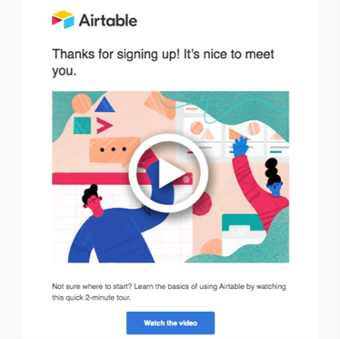
A simple and straightforward email, like this example here from Airtable. “Thanks for signing up!”. It’s clear and to the point. The human element in the copy with “It’s nice to meet you.” In the same way that you would say this to someone you met for the first time. This brings in the human touch which helps to build relationships with your new subscribers. The welcome email journey should be focused on providing value - what is the value of subscribing to your newsletter? A welcome journey is also an optimal opportunity to discover more about your subscriber, what they like, and their interests, and promote other channels such as the App. Like this example here from Tinder:
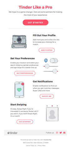
This email contains gif elements where the imagery moves to demonstrate to the user how easy it is to add their preferences.
This information could be captured using a preference centre, link behaviour tracking, or more advanced options such as AMP in email. Either way, the welcome journey should be treated as the first stage of getting to know someone like we would in a non-digital world, human to human. We wouldn't continue to have irrelevant conversations because the other person would soon lose interest; we would be interested to learn more about them, and the same should be applied here in this automated email journey.
In marketing, curiosity should be our middle name! We are curious to understand consumer behaviour, to discover more, and to develop optimal experiences not just for our organisations but also for our subscribers and customers. It is tough to do that if we haven't experienced our email marketing or journeys for ourselves. So, critically evaluate your email marketing journey to determine how effective it is currently at invoking and developing a positive first impression to your new subscribers:
- Are the emails being sent still contextually relevant? A lot has changed in the past couple of years. Do they consider changes in consumer behaviour and advancements in technology?
- Are elements such as dark mode and accessibility considered?
- Have you experienced those automations as if you were a subscriber and a customer?
- If not, sign up today! What is your signup process like? Test this out and critically evaluate what works and what doesn't.
- What were your first impressions of the email you received? Does it match your brand's values?
- What happens after the first email? Are more sent, or is the subscriber immediately entered in the weekly or daily promotional emails?
- Evaluate what you would change, keep and stop.
- Have you experienced your competitor's automation?
- What is their signup process like?
- What was your experience of their welcome journey?
Now it’s your turn to explore the areas covered in this blog in your welcome journey. How could you add more value to your new subscribers and start building a relationship with them?
 Photo by Pablo Gentile on Unsplash

 How to resolve AdBlock issue?
 Jenna Tiffany is Founder & Strategy Director at Let'sTalk Strategy providing strategic consultancy services across the digital marketing mix. Jenna is a Chartered Marketer and elected Fellow of the IDM with over ten years’ marketing experience across both B2B and B2C. Jenna has consulted with brands such as Shell, Hilton and World Duty Free to name a few on digital and email marketing strategy.