 How to resolve AdBlock issue?
 Six tips for email design best practice

Delivering an exceptional customer experience is what we email geeks are striving for. We want to surprise and delight, under promise and over deliver. We want our subscribers to be hooked, coming back for more and waiting for our following email to land in their inboxes.
Newsflash, unfortunately, your subscribers won't be sitting in their inboxes hitting F5 until your following email is sent. But you can excite them when they venture into their email account and see your latest installment.
Don't let anyone fool you; email marketing is difficult! Like every f*cking difficult, and to make matters worse, you only have five seconds to grab your subscribers' attention. As a result, your email design is critical to your campaign's success. So, how can you improve the look and feel of your emails while also increasing engagement? I'm glad you asked because I have six tips that could help.
1. Your brand is everything!
I discuss finding the balance between brand and performance marketing in an upcoming podcast. You might not be able to see the instant benefits of brand marketing, but believe me, it'll make all the difference when you're looking to retain customers on a long-term scale.
Your emails should be instantly identifiable as being from your company. It may seem tiny, but minor inconsistencies in your emails and website can undermine trust and result in losing a potential customer. In addition, the transition from email to website should be seamless and natural if you maintain a consistent style.
One of the essential methods to ensure brand awareness is to have an easily identifiable 'friendly from the name,' which might be your company's name or a staff member - this is something to experiment with to find what works best for your brand.
Then make sure your brand name and logo are prominent in your email header and that your brand color palette and picture style is consistent throughout your emails and website. Having a consistent brand style allows for a seamless transition from email to website and improves your overall brand identity and recognition.
2. Think Mobile first
I know, I know it's 2022, why are we still having to think mobile first! Well, because a lot of us aren't. I don't just mean making sure it looks right on a mobile device but also making sure it's functional. It's all about form and function.
Consider those reading your email on a smaller screen when developing it. On a smaller screen, you must ensure that the design works and that the parts you want to be visible right away are still above the fold. Another thing to keep in mind when designing for Mobile is the CTA. If they're too close together or not big enough, "fat finger syndrome" will make navigating a re-worked email for Mobile a nightmare to work with.
Suppose your email editor allows it to use the preview function or send test emails to multiple devices. Test, test, and test again, ensuring everything looks and works perfectly. It might take a bit more time to do, but avoiding egg on your face is worth it.
3. Hit them high and low
You need to make use of all the available space you have on the page. So set the tone for your email with headers and footers that support your brand identity. As previously mentioned, your logo should be prominently displayed in your header, as should some quick links to popular pages on your website - this is something you should experiment with to determine what works best for you.
Ensure a link to your preference center and the unsubscribe button are displayed in your header and footer. It can be considered a bit of a faux pas, but I've always likened hiding the unsubscribe link (especially) in just the footer of your email to knowing you're about to be dumped by someone then avoiding all calls and texts for that person. It's going to happen, so don't hide away from it. Giving your subscriber an option to manage their preferences alongside the unsubscribe link will show them they have opportunities to change the type of content they receive and possibly the cadence too.
Also, if they want to subscribe, don't hide the option. Could you give them the easy way out? If they can't find the unsubscribe link, their only alternative will be to hit the spam button, which causes more pain than letting them leave.
Regarding your footer, don't be afraid to give them other options—more content on the same topic, further learning, or recommendations that other subscribers have found useful. Being useful makes you pretty much indispensable. You can also use your footer to link to your social media profiles and, if you have one, to download your app.
4. Accessibility
Think alt text. It's critical to supply appropriate alt text when you have images in your email, especially if your email is purely images. The alt text will appear if the image doesn't load or if you're using a screen reader. Short and descriptive alt text is required. It should describe what's in the image so that people who don't see it may still follow the story.
Again, test it out before you hit the send button, double-checking that your email makes sense without the photos; they should support rather than carry your message.
5. Hyper-personalized content
Another way to make your email stand out in a world of congested inboxes and generic emails is to address readers by their first (and possibly) last names. It's a simple tactic but still a compelling way to let them know you do know them, and this is indeed for them and entice them to open and read your email.
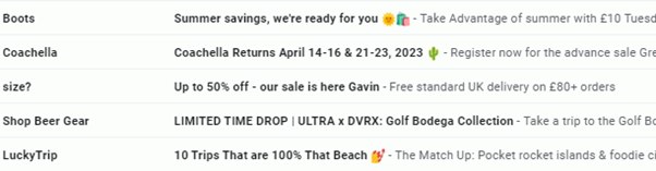
This snippet from my inbox shows how Size? is trying to lure me in with significant discounts and by using my name. This leads me to believe they know me and that the offers inside will have been handpicked for me.
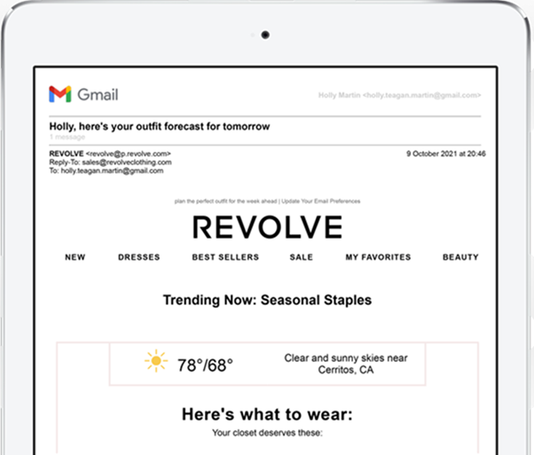
While first-name personalization is effective, you can do much more with your data. For example, you can use dynamic blocks to display readers stuff that is relevant to them, much like this email from Revolve. Based on the recipient's location, they can pick out an outfit that'll be just right for the weather in your area. That is a lovely touch.
You can also utilize shopping or browsing data to provide highly targeted product suggestions and information back in stock that may spark your readers' interest. You may develop personalized and relevant communications by employing the data you already have, making things easier for your consumers and more effective.
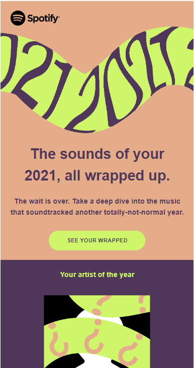
An email such as Spotify wrapped is an excellent example of hyper-personalization. The content within is purely for me. And although I said your subscribers wouldn't be waiting for your following email to arrive, when data is used in this way, they might be waiting.
6. Keep it simple
Or, as I would say, KISS, Keep It Simple Stupid. Let's be clear I'm not calling you stupid, but you need to make things super easy for your readers. You don't want to give your reader too much information. Have a clear purpose for your email, and then build it to promote that goal. A clear, concise language that clearly explains the subject of your email and excellent photos to match it will result in an email that is both visually appealing and click-worthy.
The layout and positioning of the various elements in your email are pretty significant. Regarding your campaign, the space referred to as "above the fold" — that is, viewable without scrolling – is premium real estate. Because specific components are placed above the fold, even the most inattentive readers will see them; make sure to include a call to action here.
If you cram too many messages into a single campaign, your readers will become confused and more inclined to delete the email instead of clicking through. So please keep it simple and effective. One explicit aim and message is significantly more likely to lead to a conversion.
 Photo by Photo Boards on Unsplash
About the author
 Gavin is a veteran of over 15 years in the email marketing industry and heads up dotdigital's thought leadership team. He’s a keen blogger, speaker, and sits on the DMA email council. He’s worked closely with organizations in B2B, B2C & NFP across Europe and the US, helping them to build their email programmes to drive increased customer experience, lifetime value, loyalty and ultimately return on investment.