The psychology of choice. Crafting compelling emails for results.
Ever wondered what influences your audience as they open, click, or engage with your emails? This article is your key to understanding the psychology behind those choices. We'll unravel the science and craft of creating emails that not only capture attention, but also drive action and long-lasting customer connections.
|
Note: The Author of this blog post, Nick Crawford (Twist Consultancy), will be leading a discussion on this topic during the OI-members-only Live Zoom on Thursday, December 14, 2023. OI members -- see you there! Not a member? Join today -- or reach out to Jeanne, our general manager, to learn more. |
“Let’s go out for dinner” your friend suggests. “Great” you say, “where do you want to go?” “Let’s try somewhere new”. So, you reach for your phone and tap in ‘restaurants near me.’ There are three choices displayed. Not so tricky to pick one and make your booking.
Now imagine you tap in your search and a list of 15 restaurants appear. Different cuisines, price points and review comments. Suddenly making the right choice becomes a stress! “Eat in?”
The psychology of choice matters in your email creation. It can help you to create content that is more engaging and persuasive. By understanding how people make decisions, you can create content that makes it easy for your audience to take the desired action.
Let’s look at six key areas (and the psychology behind them) to create effective, enjoyable emails:
- Reducing the number of choices
- Anchoring
- Using scarcity and urgency
- Highlighting the benefits of taking action
- Social proof
- Making it easy to take action
Reduce the number of choices (Paradox of choice)
People are more likely to make a decision when they have fewer choices to make.
Too many choices can lead to decision paralysis, where people become so overwhelmed by the options that they are unable to decide at all. When writing your emails, try to reduce the number of choices you give your subscribers. This can cover a range of considerations. The number of products or services displayed, number of stories in a newsletter or use of multiple CTA buttons and links.
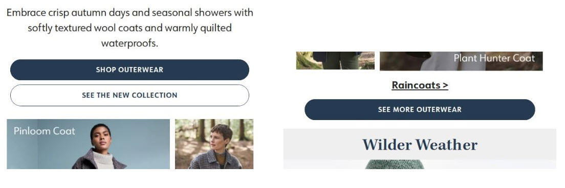
Here’s an example from a fashion brand where multiple CTAs are presented together.

Every email should have a primary objective. How many choices are you making your subscriber consider. Look at your email in its entirety and assess.
Anchoring (Anchoring bias)
People rely heavily on the first piece of information they receive when making a decision.
Help your readers (and the success of your email) by incorporating the principal of ‘Anchoring’ into your content approach. This principle recognises that there is a cognitive bias towards relying on the first piece of information encountered (the "anchor.") This bias then impacts your subsequent judgments and decisions.
Strategically presenting the most important or persuasive content early in the email, ensures that it serves as a positive ‘anchor’ that guides readers toward the desired action or choice.
Use scarcity and urgency. (Scarcity principle)
People value things more when they are scarce or have a limited time offer.
Creating a sense of scarcity and urgency can also encourage your subscribers to take action now. An increased value heightens desire and so motivation to act faster and more decisively.
In your emails, you can achieve this by mentioning that an offer is only available for a limited time or that only a limited number of spots exist. You can also create a sense of urgency by using words like "now" and "today.” As with all approaches, they should be used periodically, not continually. This maintains credibility and trust that the message is true (we all know businesses that always have a ‘sale’ on.)
Highlight the benefits of taking action. (Loss aversion)
People are more motivated to avoid losses than to acquire gains of equal magnitude.
Make it clear to your readers the benefits of taking the desired action. This is because people are more likely to act if they know what they will get out of it. We often talk about the ‘value exchange’ in marketing, but so many times you’ll find that content is about the ‘what’ not about the ‘why.’
Features are important, but your lead messaging should highlight the benefits to your prospects and customers. Review this across both main copy and CTA wording. It’s even more crucial in email where often you are providing a short summary, sign posting further content on your website. To effectively create the click you need, be front and centre with how the reader benefits.

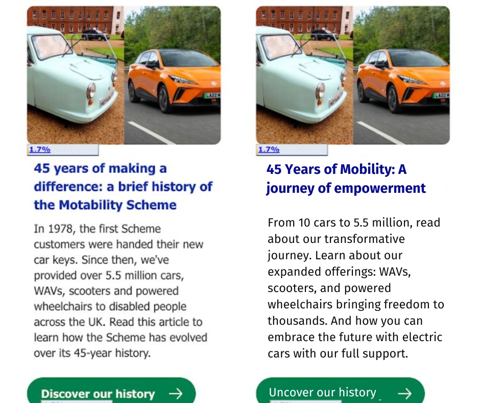
A mocked-up version of an alternative approach to copy creation. On the left the original. A more passive descriptive approach. On the right a benefit driven focus. Note the use of “Learn…” and “How you…”
Use (Social Proof)
People are more likely to do something if they see that others are doing it.
The phenomenon of people following the actions of others. This taps into the fact that many people assume that others must know what they are doing. So, their actions must be the right thing to copy.
Use social proof to encourage your subscribers to act by mentioning the number of people who have already taken the desired action. For example, you could mention that thousands of people have already signed up for your free trial or that hundreds of people have already purchased your product.

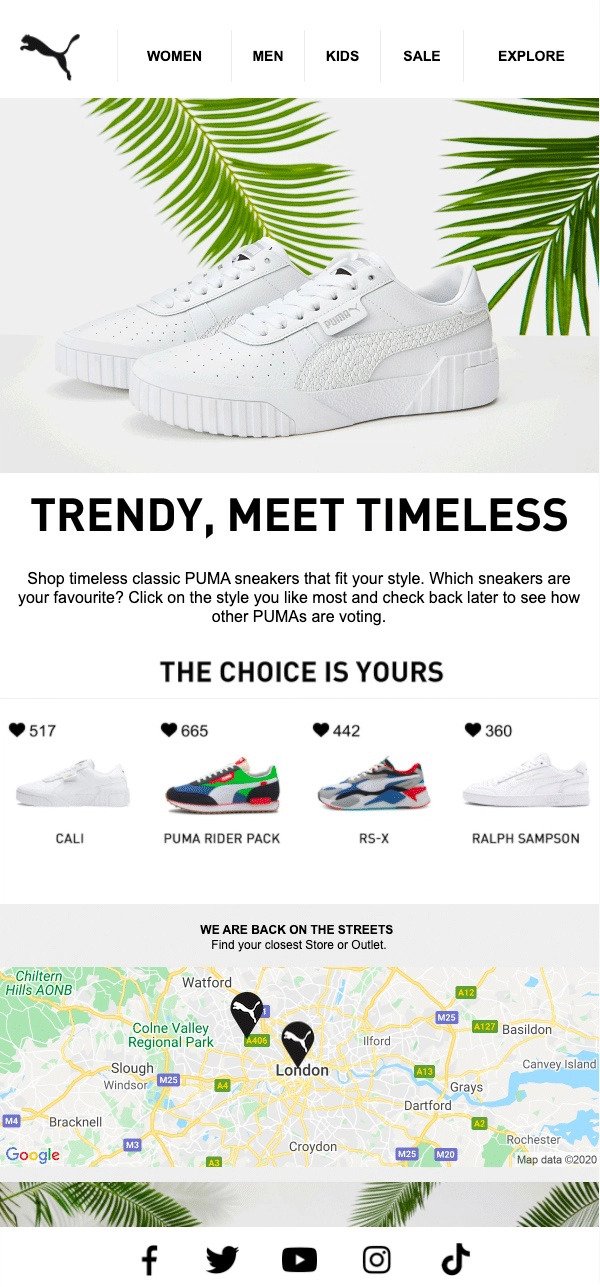
A really nice example from Puma showcasing the engagements (number of clicks) on each product by showing the number of likes displayed alongside a heart icon.
Make it easy to take action. (Cognitive ease)
People are more likely to take action when it is easy to do so.
Make it easy for your readers to actually take the desired action, removing any friction or obstacles that might prevent this.
As a planning principal consider this key question…
“What do you want the reader to do after reading this email and how easy is this?”
Does the headline, image and copy all create an easy-to-understand context and message. Does the flow lead to a simple and stand out Call to Action.
Your CTAs should be clear, concise, and easy to understand. Avoid using vague language. For example, instead of saying "Click here to learn more," say "Sign up for our free trial today."
Make sure your CTAs stand out from the rest of your email by using contrasting colours. And place then at the top and bottom of your email to allow immediate click on open or after a scan read through the email.
Conclusion
Understanding the psychology of choice will help you create effective and engaging email campaigns. By appreciating how people make decisions, you can create emails that make it easy for your prospects and customer to interact with your content.
Focusing on these six key areas will help you create emails that are more likely to resonate with your audience and so achieve your email marketing goals. The win win of customer centricity.
Increased engagement and conversion rates: By understanding how people make decisions, you can create emails that are more likely to engage your audience and encourage them to take the desired action.
Improved customer satisfaction: When you make it easy for your subscribers to act, they are more likely to be satisfied with their experience.
Stronger brand loyalty: When your readers have a positive experience with your emails, they are more likely to become loyal customers.
Thank you for reading. Hopefully you are now fully equipped to use these insights of ‘the psychology of choice’ to create email marketing campaigns that generate results for your business and great experiences for you audience.

 How to resolve AdBlock issue?

