
 How to resolve AdBlock issue?
 Time to give your newsletter some love? A case study to help inspire.

Summary
What’s the purpose of your newsletter? Often one of the largest and most frequent sends from a brand, but often a compilation of message and objective, as it tries to do all things for all stakeholders.
When trying to speak to all of your audience at the same time, what works and what doesn’t. This article is a summary of how a review of the Royal Society for the Protection of Birds’ (RSPB) newsletter led to some clear content approach outcomes, as they moved from a monthly to weekly send (part of their Covid19 response strategy.)
The background
Newsletters are a common staple of the email marketing campaign mix. A way to regularly provide multiple messages across your whole audience base. However due to this mass send, they often suffer a lack of strategic or success focus, especially where revenue is not the core purpose.
One of my clients is the RSPB. They are the largest nature conservation charity in the UK, with a global presence and offer a range of ways for supporters to get involved including:
- financially through membership and donations
- campaigning
- reserve visits, activities & events (many now virtual)
- online shopping
- community and volunteering
In a locked down world, the green spaces and nature around us has become more valued by many. The RSPB has seen a considerable increase in traffic as more people than ever are noticing, enjoying, and finding comfort in the natural world on their doorsteps.
Originally a monthly newsletter (branded ‘Notes on Nature’), as part of the Covid19 response (April) it was decided that to enable a more reactive and frequent update to all supporters, a weekly version would be introduced in between the monthly sends. Shorter and more tactical, a brand differentiation was created (‘Notes on Nature Bitesize’)
Seven months on and having agreed that weekly activity was to become the standard approach, I conducted a newsletter review. Below are some of the key considerations, approaches, conclusions, and considerations, to help inspire and inform a review of your own newsletter activity.
What is the purpose of your newsletter (why are you sending this email)?
In my experience many clients struggle to answer this question succinctly. In part because there is no clarity of success metrics beyond a benchmark of average open, click, and revenue.
One of the ways I get stakeholders to begin to articulate this, is by asking ‘if you didn’t send this newsletter, what would happen?’
Often there are very specific objectives surfaced e.g. to provide specific information (to a specific segment of the total audience e.g. members) or to promote an event or activity. As each of these are surfaced a consideration should be made as to whether inclusion in a mixed message format or a dedicated send, is most appropriate and effective (including a consideration of build resource vs. marketing return)
For the RSPB the purpose of the newsletter was defined as a way to provide all supporters with summary information on the multiple projects underway and ways to get involved with the organisation.
Currently there is no preference centre in place, so the danger is that activity-specific sends, e.g. an appeal only sent to past givers, ignores other supporters that might now be interested. But sending solus sends to all supporters, on all topics, is not sensible either.
Dynamic content blocks are used to create some personalisation based on member, family, and country segments. Any content inclusion should be potentially relevant to supporters and provide a summary view, linking to more detailed information online.
Defining this clarity of purpose for your newsletter can then help to justify and prioritise the content inclusion decisions, key when there are multiple parts of a business all wanting to get their message in front of everyone.
Survey results – asking our supporters what they want
When’s the last time you asked your email audience what they wanted to see? And what their experience of your emails is? We can infer a lot from response tracking, but asking explicitly also helps highlight assumptions.
The move from monthly to weekly was a major change so we asked our supporters what they wanted. We also used this as an opportunity to ask for content preferences.
In April we asked two simple questions:
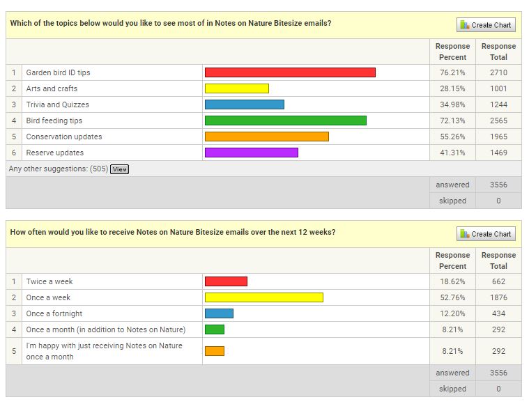
By also asking for ‘other’ content ideas this allowed us to start to create a planning framework for future sends.
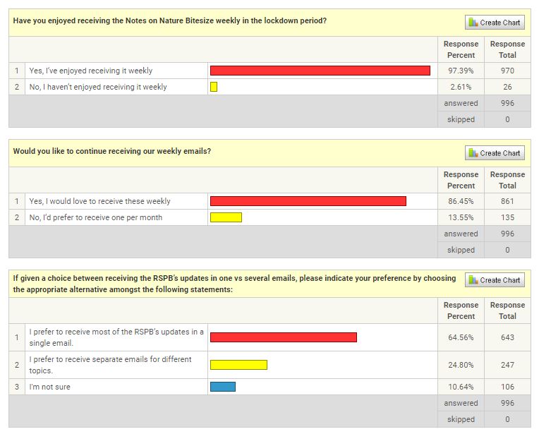
In June when consideration was being made to make a permanent move to weekly, we asked again:
Review of past performance – and actually, how do you measure this?
What does good look like? Without having defined any real success measures for the newsletter sends, there was no answer to this question. And so no agreed benchmark metrics by which to define future improvement.
My first step was to review past sends grouped by the original monthly and new weekly newsletters. Source data was collated to provide a performance summary across standard performance metrics; delivered, open, click of delivered, click of open and unsub.
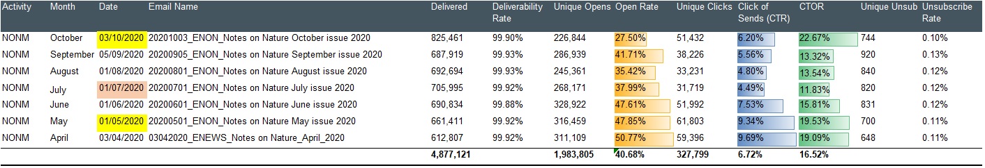
This provided a view of both average results as well as per-send variance. The average open and click provides a simple Key Performance Indicator for reviewing the performance of future sends.
Using conditional formatting to create the in-column bar graphs, helps highlight high and low performance, but a simpler view was needed for business wide review and insight. To achieve this, I created a summary graph highlighting key peaks and troughs in performance.
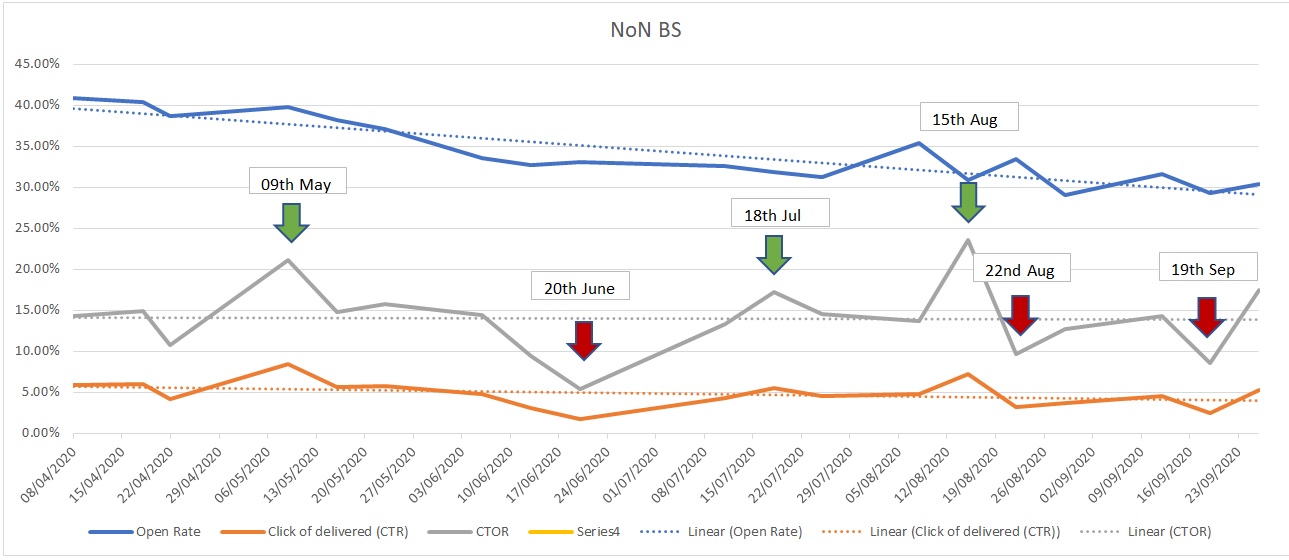
This approach provided an easy-to-read view of open, click and click-of-open (CTOR), as well as the trend over time. It then helped focus the next stage of details content assessment, based on key sends identified across high and low performance.
CTOR has been used as the primary success metric as this review was focussed on assessing content engagement.
Peak open rates where CTOR was lower was also assessed. The conclusion here was that vaguer, but intriguing subject lines e.g. “Notes on Nature Bitesize: Meet the Skydancers” created interest, but with a less clear content expectation set, the actual content in these cases did not resonate as well. High open, less click created a shared peak and trough as you can see on the send prior to the 15th Aug.
Marrying email performance with content
It’s a very powerful exercise to lay out your past email send content in a way that allows you to see them side by side. Adding an overlay of top 3 content blocks based on click shows you what your audience has (and has not) engaged with. If you don’t do this on a regular basis, I would suggest this is a key activity to introduce into your reviews.
By grouping these visual reviews into high and low performances, it allows a much easier assessment across; look and feel, layout, content type, tone of voice, etc. from which to develop your future standard approach, as well as define a testing plan.
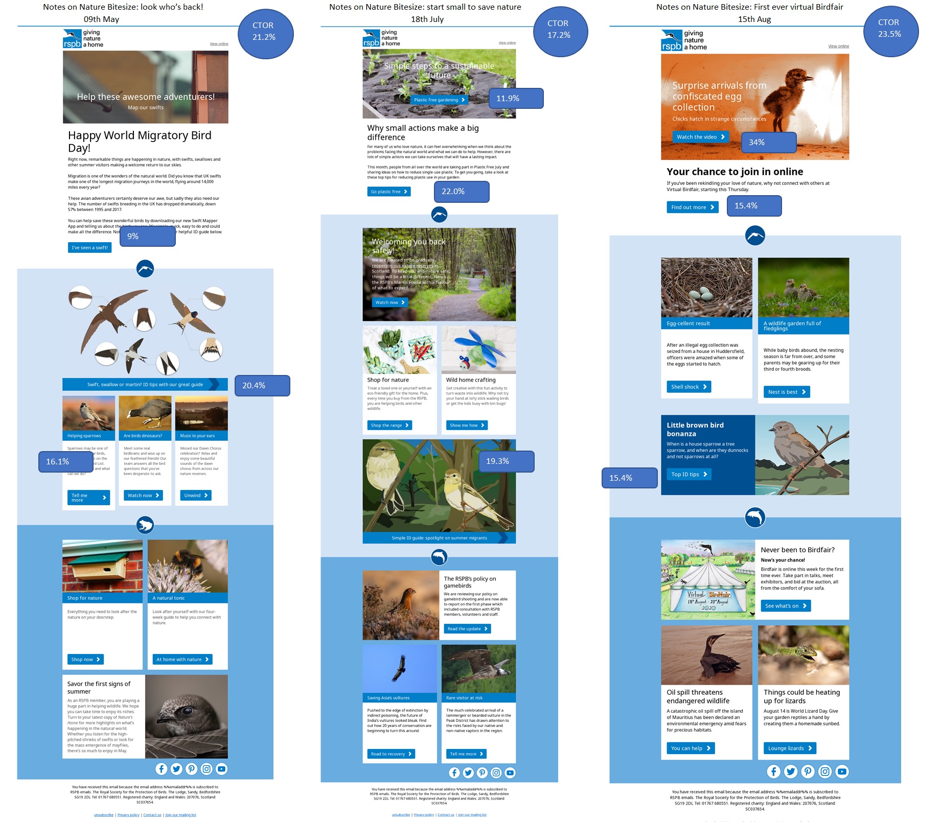
Top performers
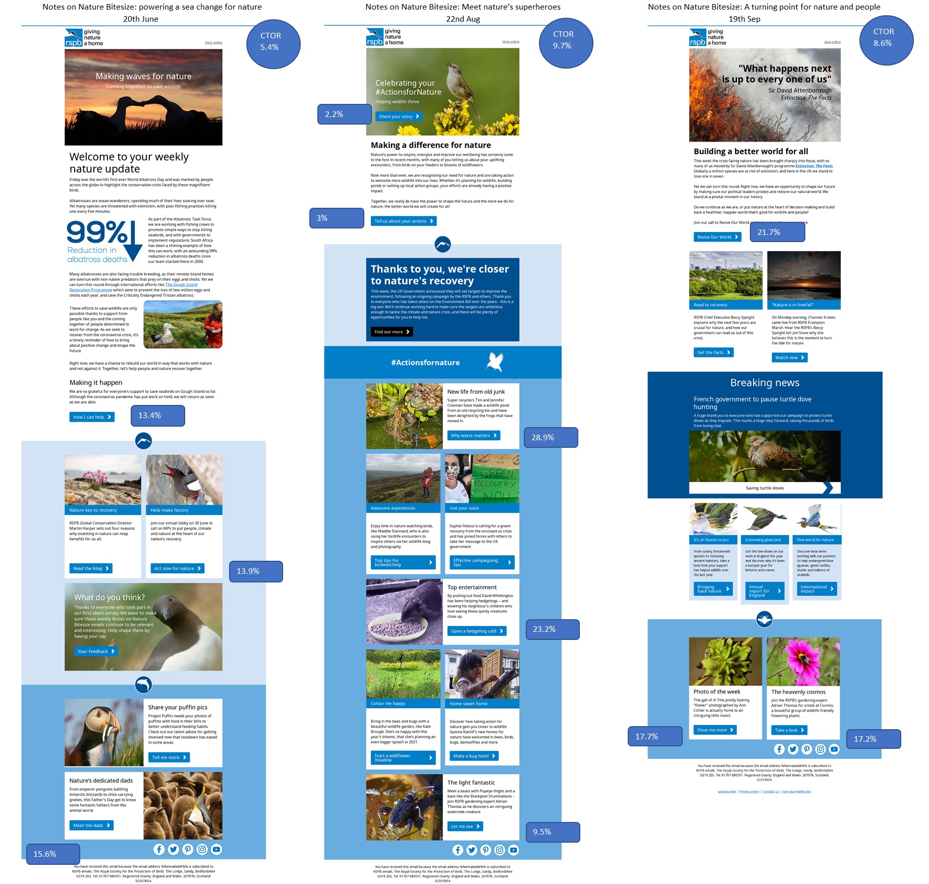
Worse performers
With CTOR rates varying from 23.5% to 5.4% there was clearly a large variance in content engagement across sends. Understanding what might be causing this was vital in planning how to optimise future sends. As marketers we should all be asking ourselves “what does good content look like?”
Some of my conclusions included:
- Use of great animation on the hero image – two out of the top three sends used this. Drawing the reader into the email, moving beyond the ‘is this worth my time’ to ‘what is that about’
- Clear call to action options available in the hero image and after shorter copy intros. This requires a clear and concise lead story, rather than a more general intro.
- Specific to the RSPB audience, content based on helping bird identification. Do you know what content your audience always engages with?
- Simple well laid-out formats with room for each content block to breath.
- Less copy and not having too many multiple rows of multiple column blocks.
Hero animation example

Proving how important agreeing your success metrics are within the business, the worse performing send based on CTOR, had previously been praised for performance based on the appeal revenue it generated.
Likewise, not all content may have a click action. We’re trying to add more ‘gives’ in our content rather than ‘asks’ e.g. “Thank yous” and “community updates.” Here dwell time on an email may be a better measure, possible via 3rd party tracking like Litmus.
Perhaps the biggest strategic conclusion from this review was that the intended divide between monthly and weekly sends had been diluted over time. Although still treated as separate sends this was clearly now an internal construct and very unlikely to be how our supporters viewed these sends. To them we simply provided a weekly update.
What’s next?
Part of the skill of being a great marketer is being able to find the ‘so what.’ How do you use the past to inform the future?
The separation in monthly and weekly content planning has been removed. One single planning doc has been created to capture both key themes and activity based on time of year, as well as space in each send for more reactive and immediate stories, as they occur.
Based on the content engagement review, for the first time we’re creating a structured testing plan specific to these sends. To prove that our assumed conclusions on what drives great engagement is true.
Some of these tests include:
- Animated gif impact
- Long form vs. short form versions
- Impact of removing reference to ‘Notes on Nature’ from the subject line
- Layout of content e.g. triplet vs. full length
- Use of CTA in hero image
- Background colour impact
- Use of social share links
I’d love to be able to get your thoughts on other tests we could add to this list based on your experience.
In conclusion
It takes discipline to review your sends in detail (we all suffer from the more pressing need of the next send.) But hopefully this study shows that based on some key review steps, it can be achieved with a degree of simplicity.
The effort and resource used to gain this insight to inform future planning has been really worthwhile, resulting in a more audience centric, engaging weekly send. With a little love and attention, how much more could your newsletter provide to you and your audience?
About the author

Nick Crawford, Owner of Twist Consultancy
Nick’s mission is to help businesses win and retain customers with relevant and engaging marketing by reshaping their strategy, delivery and training.
Working with B2C & B2B clients for over 15 years, he has a deep understanding of data-driven marketing & strategic planning. Experience spans across CRM, Direct Marketing & Automation, with a specialism in email and cross channel integration.
An elected member of the DMA Email council and IDM Tutor of their Digital Diploma. Nick also holds a Post Graduate Diploma in Digital Marketing from the Institute of Data and Marketing (IDM)