
 How to resolve AdBlock issue?
 You can do THAT in an email???
We’ve noted an increase interest in Gifs recently, presumable because they are now supported by virtually all email clients and even (gasp!) Outlook. Animated GIFS are known to increase reader attention and help to improve the email experience as well as support key messaging. These short meme-like animations can quickly catch the eye, but their repetition can also become annoying if used without clear purpose.
My team and I, along with our clients, have been exploring the limits of animated GIFs, as well as other interactive formats for quite some time now. We have always found them to increase engagement significantly. But with recent events, we’ve been ramping up their use in most of our consumer campaigns.
In this article, we’ll take a look at a few of our favorite formats and how they can help drive home a powerful message. All examples are from one of our clients, a popular resort destination in Quebec, Canada’s French-speaking province: Mont Tremblant Resort.
Tremblant is the No1 Ski Resort destination in Eastern North America. It is also a top summer destination offering a resort experience that’s second to none. The challenge is communicating such a comprehensive offering to convince skiers that Tremblant is also great in summer. The experience is structured around four distinct brand attributes: Mountain Playground, Pristine Waters, Joyful Living and Immersive Events.
|
Note: Mark will be leading a discussion on this blog post during the OI-members-only Live Zoom on Thursday, October 19, 2023. OI members -- see you there! Not a member? Join today -- or reach out to Jeanne, our general manager, to learn more. |
Video animation
The first is perhaps the most obvious and yet sometimes the hardest to pull off without careful preparation. Taking a 5-second video clip and transforming it into an animated GIF is reasonably simple to execute, but choosing the right footage takes some finesse. You really have to plan for them in advance in your video shoot scene list.
Also consider the mobile experience. If you’re like most brands, over half your subscribers will view your emails on a mobile device. Plan ahead and always shoot vertical footage in addition to horizontal. An added bonus: your social media team will love you for it.
From a technical perspective this can be an easy win. Edit the video to the desired length, make sure you sync the first and last frame to create the illusion of a continuous movement (see example). For maximum effect choose a background that doesn’t move behind the main action for a more fluid scene. Import into Photoshop and export as a GIF. Keep in mind that the more colors in the scene, the grainer or heavier the image will be.
Supported by: pretty much all email apps.
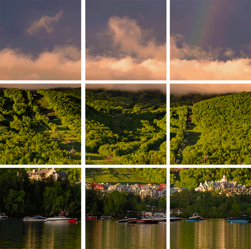
Animated Mosaics
When attempting to convey a multidimensional experience, the animated mosaic format works great.
The animation moves the eye around the mosaic, drawing attention to each tile as the mosaic unfolds.
From a technical point of view, pay attention to the pacing of the tiles. Too fast and everything becomes a blur. Too slow and you may miss the animation entirely. We like to reveal images out of order to allow focus on each image. You can also create a pattern reveal where the mosaic builds from white or creates a wave effect.
Supported by: pretty much all email apps.
Rotating banner slideshow
When you need more than an animated GIF the Rotating Banner slideshow is a great format to work with.
You have much better image quality than a heavily compressed GIF. Plus, each frame (including text and button) have their own distinct URL.
Technically more advanced than a GIF it will require a bit of coding. Essentially it is a CSS animation created using successive Keyframes. You’ll also need to do a little simple math to get it right. Start with the target duration of the entire scene, divided by the number of frames. That gives you the duration per scene. You then assign a start time and a duration for each frame. As each frame disappears from view, it is replaced with the next. For email apps that don’t support this format, there is an animated GIF fallback. Only drawback is that there in only one link, which points to a common page instead of to each event.
Supported by: Webkit email clients.
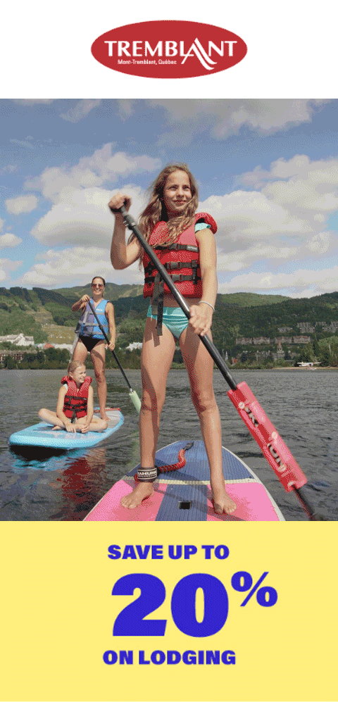
Flipcards
To create a more compact message and reduce clutter, the flip cards allow you to position text, CTA and buttons on the “back”. Each card has its own unique link to various pages on the website. You can use the click data to analyze a reader’s interest in a topic and customize future content accordingly.
In this example, we used four cards, for the four pillars of the resort experience, but you could use more, or less as needed. We like the symmetry of this block. Notice the teaser animation (GIF) on the first card designed to attract attention and stimulate the mouseover engagement.
Technically, we used an animated GIF for the teaser and the flip was a hover action using CSS transformation.
The fallback is a simply four stacked boxes with image on top and the blue box beneath.
Supported by: Webkit.
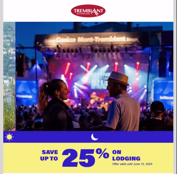
Before & After wiper
Sometimes it’s helpful to communicate the flip side of an experience or portray a different version of a scene or an item.
Sometimes a simple 2-step slide show GIF does the trick. But sometimes it’s not quite enough to create excitement and interaction.
This is where the Before & After Wiper comes in very handy. It has the advantage of viewer involvement as they drag the wiper across the image to reveal the alternate full image.
In this case, showing a day/night scene, the resort wanted to show a happy couple enjoying the mountain activities and breathtaking views by day, and the lively concerts and entertainment by night. In both images, you can see that this is no ordinary destination.
The wiper is a very versatile tool that can be used in a range of applications to show a before/after shot or two different colors of the same item. It has the added benefit of stimulating curiosity to see what is behind the hidden portion of the image.
It is technically more advanced and requires quite a bit of code. Anthony, my developer excitedly tried to explain it to me in detail, but he lost me after “it’s a table with image background with a td, one row, one column, width set to 50% plus a second empty td on top at 50% and a CSS hover to set to 100% over time plus a Keyframe for teaser image and an Outlook fallback”. See what I mean… advanced.
Supported by: Webkit email clients only + gmail. We add an animated GIF fallback for email clients that don’t support it.
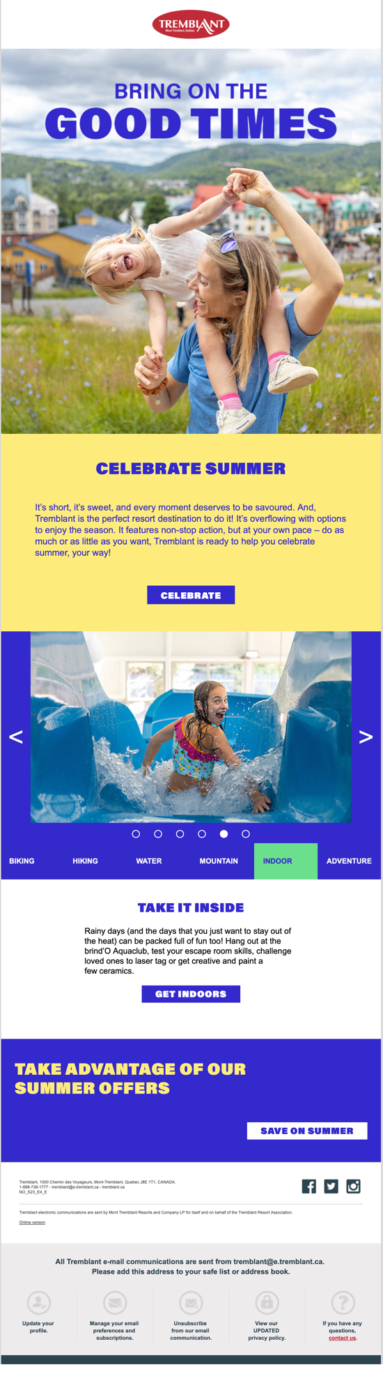
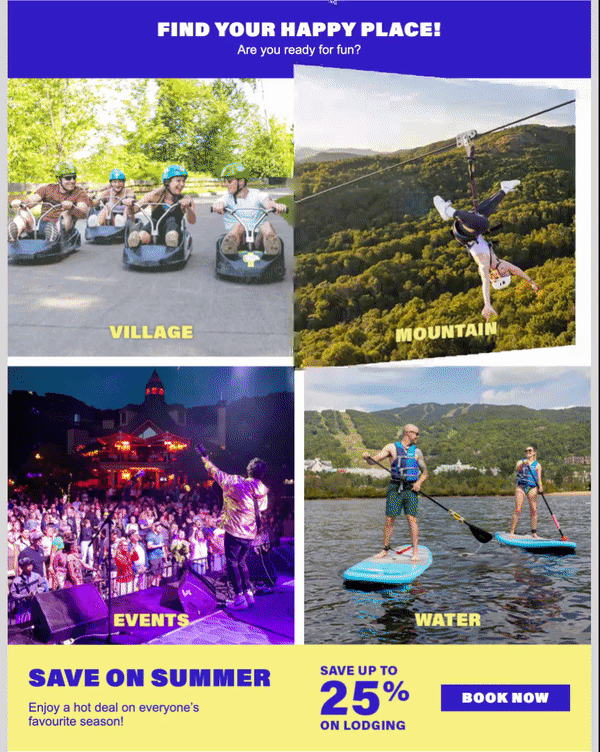
Click-to-image Selector
I wrote about this format previously but it’s worth repeating. Rather than use it to create a simple slideshow, this version allows readers to cycle through a series of topic of interest and click to learn more on each one of them.
The link clicks can be used to capture customer preferences or interests in the database for future use when customizing content or selecting dynamic hero images.
We used several visual cues to help people understand that they can interact with the asset including the navigation dots beneath the images and arrows on either side. You can also add an autoplay feature that cycles through automatically.
The text and button beneath the selector are specific to the topic and take the reader to a webpage that focuses on the topic shown in the images (biking, hiking, watersports, etc.).
Technically, this is created using, believe it or not Radio Buttons that switch content on and off. CSS attributes set the active state. The fallback is a completely different layout, displaying a featured image followed by the copy for each of the 6 topics. It’s less compact, but still looks great with all the beautiful imagery.
Supported by: Webkit only
A glass half full
You will have noticed that many of the formats are only supported by Webkit (Apple) email clients. In Tremblant’s case, that over 60% of their customers. But even if it’s only half, it’s till HALF of all customers and worth the effort. For the rest of the world, and those who still suffer through Outlook, there’s always a fallback. Not perfect, but still can look halfway descent.
It’s easy when you’ve got a great product and great content
These formats are exciting to work with for subject matter that has a lot of visual appeal. Working with a resort like Tremblant, it’s “easy” to make things look great. We’re very lucky and grateful for our relationship that spans several decades.
About the author

Mark Morin is an email automation expert and content strategist. He leads a dedicated team of email marketing aficionados at strategies.ca.