iPhone viewport
Influencer Anna Yeaman shares her tips on properly setting the "Viewport" for mobile messaging on the Iphone:
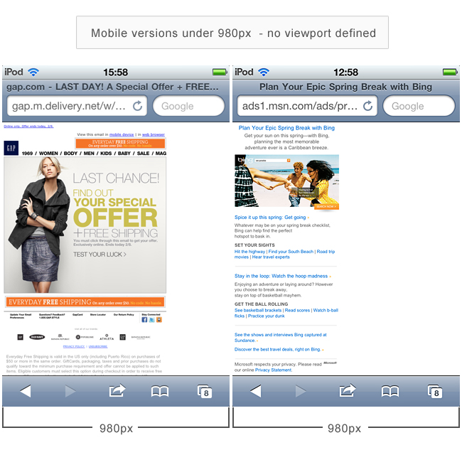
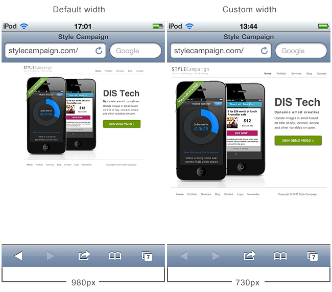
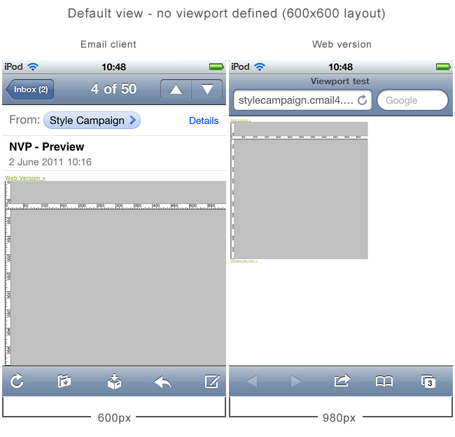
The Safari browser on the iPhone uses a 980px wide viewport. This means any layout less than 980px wide, will appear zoomed out when viewed on the web.
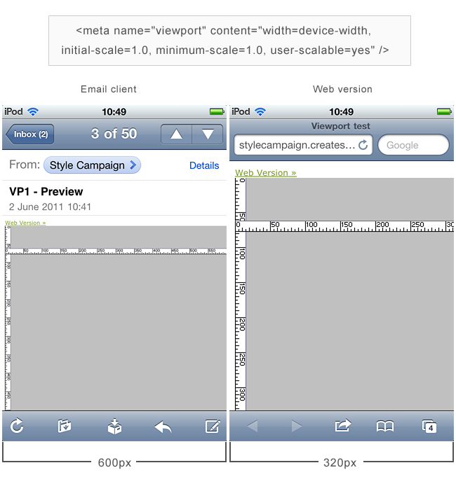
To correct this you need to define the viewport, here’s the basic code:
meta name="viewport" content="width=insert layout width, initial-scale=1.0;
minimum-scale=1.0, user-scalable=yes"
Add it to your mobile version and mobile landing pages. While our website is far from mobile friendly, defining the viewport has made it more accessible.
![]()
Email client different from web browser
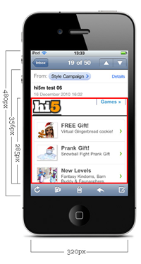
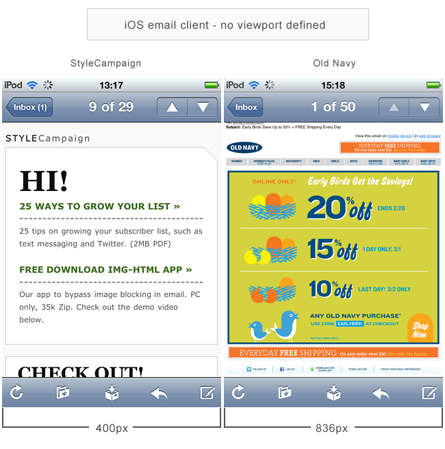
It’s not necessary to define the viewport for email viewed within the native iOS client. By default, emails are automatically scaled to fit the width of the screen.
![]()
Few tests
When I first stumbledacross the viewport over a year ago, I assumed the Webkit email client was configured the same as the browser. It took a couple of tests to realize the client was doing its own thing.
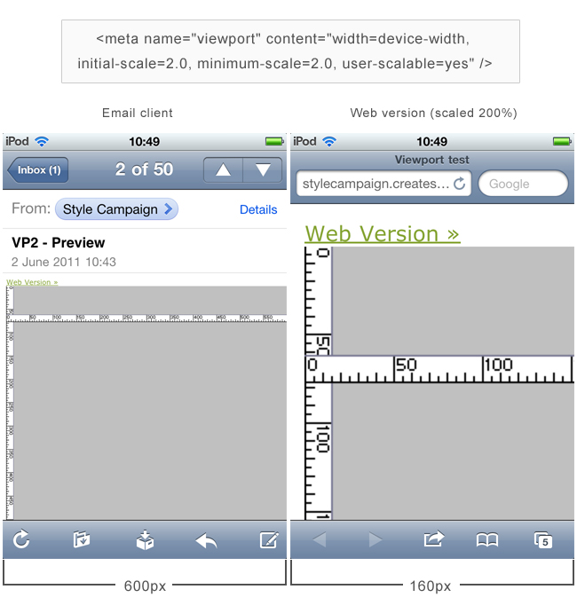
Here's some of my more recent tests, showing the same layout in the iOS email client and Safari browser (click images for full-sized).
![]()
![]()
While the Safari browser adapts to the viewport settings, the email doesn't budge.
One reason you might define the viewport, is if an iPhone user opens your email on the web, via the web version or SWYN link (automatically generated from the HTML).
![]()
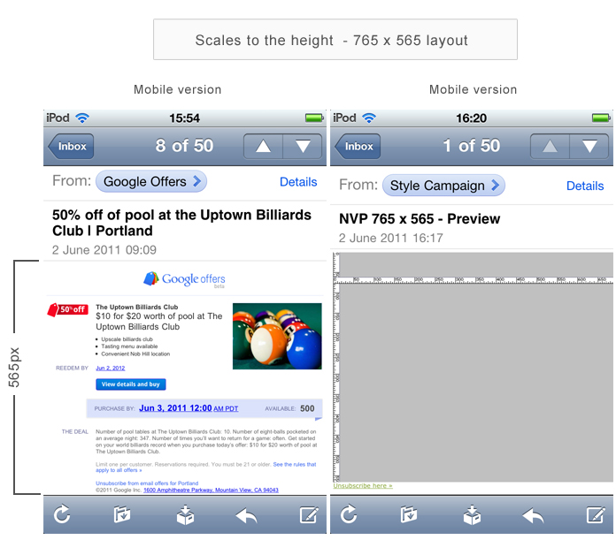
Scales to the height
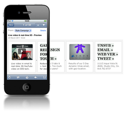
If your layout is horizontal, whereby scaling to the width would leave dead space at the bottom of the screen, then the email client scales to the height instead.
This is one reason not to use excessive footer textwith horizontal layouts, as it will force your content to be zoomed out. Though a wide screen layout also triggers the same behavior. The Goggle Offer template below at just 765x565px also scales to the height.
This animationshows how a layout - the same dimensions as Goggle Offers - scales to the width by default, then readjusts and scales to the height. To force the viewport to scale to the width, one workaround is to add an empty table to the bottom to pad out the height.
![]()
Above the fold
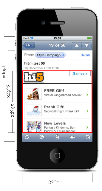
I doubt its accidental that the Goggle Offers email fits in the first screen, requiring no scrolling on an iPhone. It's important to know where the fold occurs, otherwise you end up with a cut off CTAbutton.
Here's a chart showing some common widths. Click the view link to see a screenshot of the test.
| Above the fold on iPhone 4 (iOS 4.3) | |
|---|---|
| For every 50px width + 45px height | |
| 320 x 600px | 285px view |
| 500 x 600px | 440px view |
| 550 x 600px | 485px view |
| 600 x 600px | 530px view |
| 650 x 600px | 575px view |
| 700 x 800px | 615px view |
![]()
If anyone's done any viewport research on the Android, I'd love to see it. I doubt you can override the default scale within the email client which causes content to be zoomed in, but I've not yet tested.
When you subscribe to the blog, we will send you an e-mail when there are new updates on the site so you wouldn't miss them.

 How to resolve AdBlock issue?