You had me at Hello: Welcome Messages with “WOW” Factor
If first impressions are lasting impressions, then the welcome email is key to subscriber engagement. A welcome email - or series of emails - sets the brand tone and sets expectations of things to come.
A glance at my folder full of welcome emails revealed many subject lines that read “Welcome to [fill in the blank].” Yawn. A couple of the emails had subject lines that began “A warm welcome from [fill in the blank].” How nice. Now show me the money!
Several subject lines did include offers, ranging from 10% to 15% to 20% to free shipping. Some subject lines only hinted at offers. Some of those offers had expiration dates (boo); others didn’t (yay).
Athleta’s subject line - Welcome to the Team! - is in keeping with its product line of athletic apparel. JC Penney’s subject line includes specific instructions on what to do to complete the subscription process: “Welcome! Just Open And Confirm Your Email.” Alrighty then!
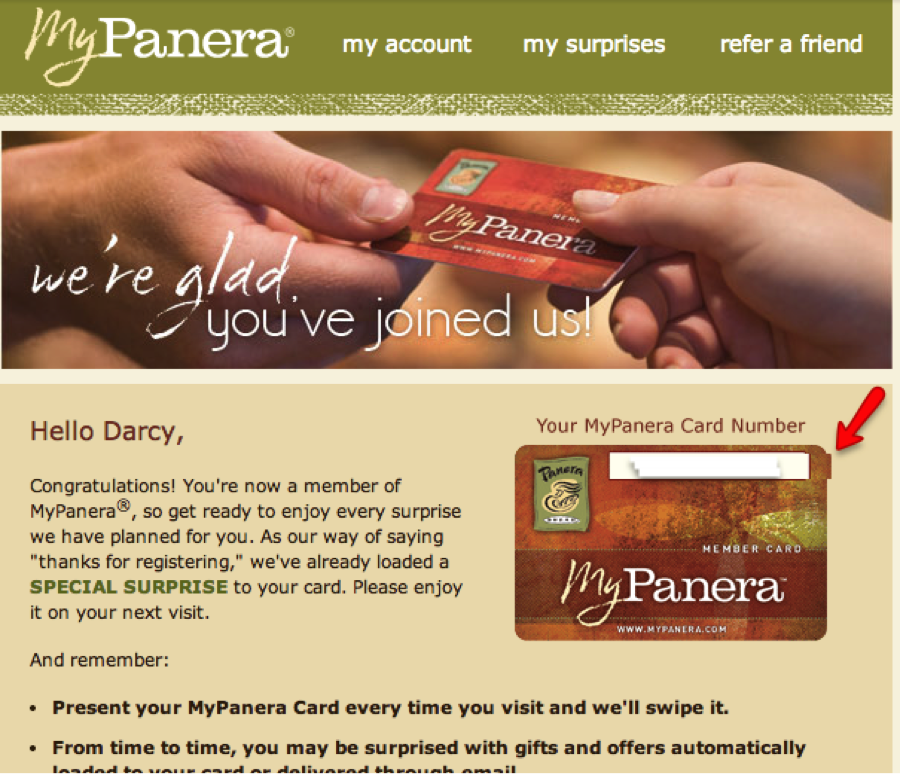
Most of the email “from” lines simply have the company’s name. That’s a good thing, especially for a welcome email. Ruby Tuesday, however, takes it one step further; its “from” line reads: Ruby Tuesday So Connected. Panera’s is “My Panera” - a nice way of inserting a bit of quasi-personalization into the mix. That’s the name of its loyalty card, and the welcome email actually does include first name personalization, along with the card number (however, the image slice for the number personalization doesn’t line up exactly with the card image):
I’ve subscribed to many emails, particularly B2B, that rely solely on the ESP’s automated, cookie-cutter subscription confirmation email. There’s a missed opportunity here. If the ESP doesn’t offer customization of the opt-in confirmation, then follow up with your own branded welcome email.
Here’s a look at a few companies that do a great job of putting out the virtual welcoming mat.
But let’s not get too ahead of ourselves. While the welcome email is important, so is the subscription confirmation landing page. It’s yet another chance to acquaint the subscriber with your brand.
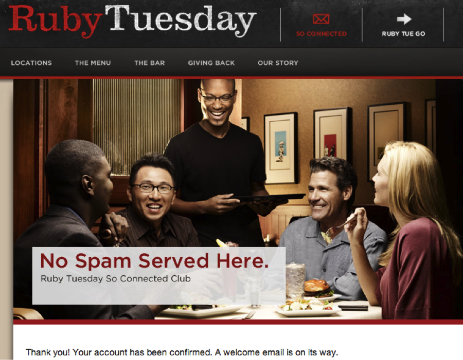
Ruby Tuesday’s landing page includes a clever play on words:
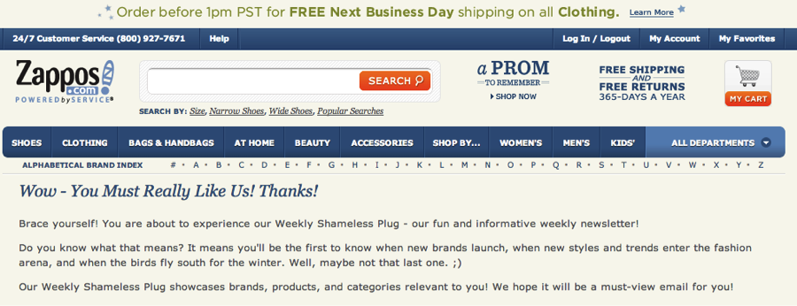
In true Sally-Field-Oscar-acceptance-speech style, Zappos uses its landing page to thank the Academy its subscribers, then gives a snapshot of what’s to come.
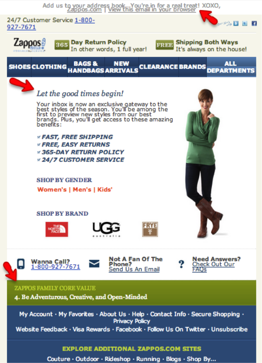
Its welcome email continues the tone (friendly, enthusiastic) and style (italic headline) of the landing page. I think the “XOXO” might be a bit overkill, though.
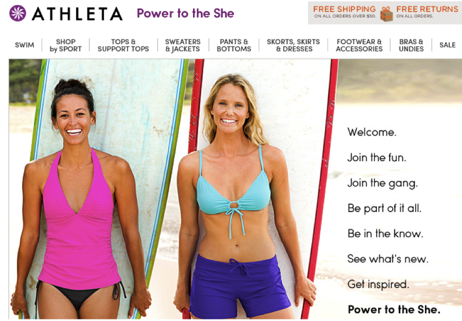
Athleta’s welcome email resonates with its female audience, reiterating the mantra “Power to the she”:
Moosejaw is the master of irreverence. Its welcome email is a case in point:
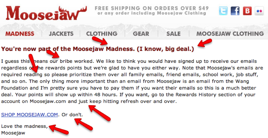
“Madness” perfectly describes the Moosejaw experience. And that’s OK. It’s what Moosejaw customers come to expect. Anything less would be a disappointment.
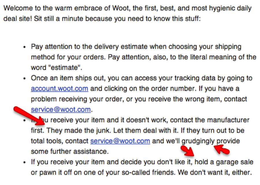
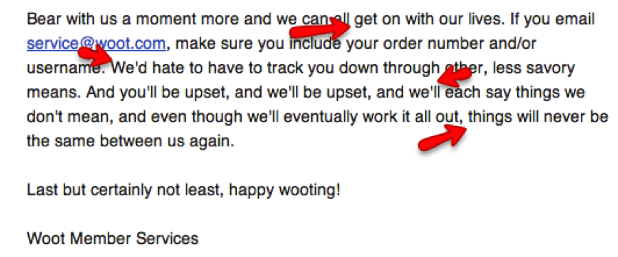
Woot is another company that’s delightfully cheeky. Even its name reflects a fun-loving, laid-back attitude. A couple of excerpts from its welcome email say it all:
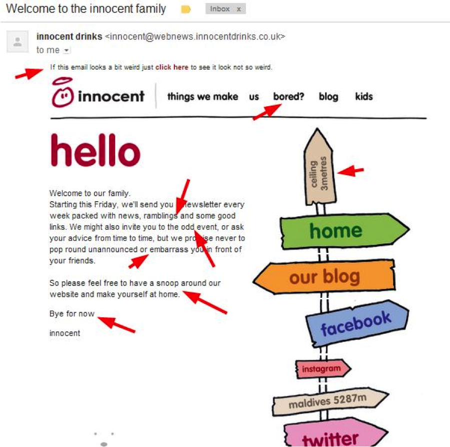
The UK’s Innocent Drinks also uses humor effectively:
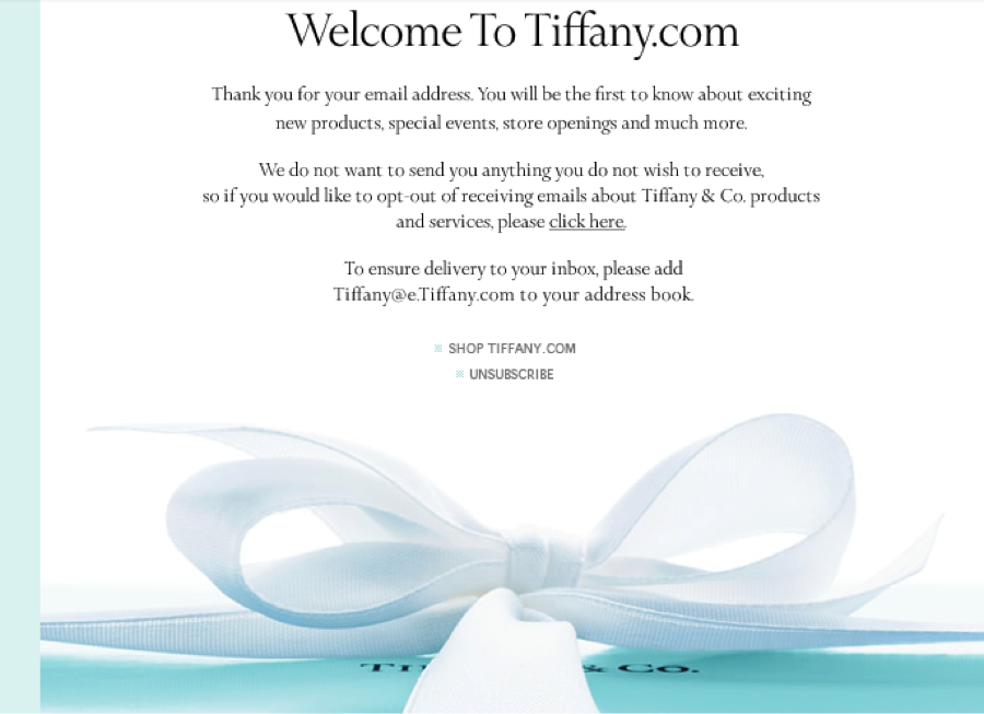
Moosejaw’s and Woot’s irreverent tone is in keeping with each brand’s voice. However, if a luxury brand, such as Tiffany, tried this it would come off as inauthentic and offensive. Tiffany’s welcome email is true to character - simple, straightforward, and incorporating its iconic robin’s-egg blue:
There’s no one-size-fits-all guideline for welcome emails. Successful welcome emails - like any email - are those that are true to the brand and resonate with their audience. However, a company must live up to the expectations it sets for product, pricing, customer service and more.
Otherwise, it’s like pulling out the welcome mat from under your subscribers’ feet.
When you subscribe to the blog, we will send you an e-mail when there are new updates on the site so you wouldn't miss them.

 How to resolve AdBlock issue?