"While our subscribers sign up for emails to save money on products/services, keep up with industry trends or simply to be entertained, those of us in the industry usually have ulterior motives when opting in to an email list. I subscribe to hundreds of emails - and to email subscription services like Milled, Mailboxr, Patroneer and The Swizzle - so I can keep swipe files on everything from copy to design to offers and more."
"Today, I am going to switch gears to a more tactical focus by sharing where video in email is supported, specific techniques and tools you can use to maximize your in-email video coverage, and best practices you can use to create compelling subscriber experiences."
"For over a decade, marketers were told that the only way to implement video in email campaigns was to include a link in the email pointing to a video playing on a landing page. Placing a video in the email message itself was looked upon as a fool’s errand at best, or the precursor to disastrous deliverability and subscriber experiences at worst. "
"In today’s post, I outline how the landscape has shifted in the world of video in email, and why more marketers are embracing this tactic now than ever before. "
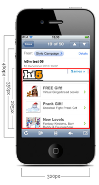
Influencer Anna Yeaman shares her tips on properly setting the "Viewport" for mobile messaging on the Iphone:
The Safari browser on the iPhone uses a 980px wide viewport. This means any layout less than 980px wide, will appear zoomed out when viewed on the web.
Do you need to go skinny for mobile? There's a huge variety of screen resolutions to design for. Putting aside fluid layouts, how wide should a fixed width email be? According to DeviceAtlas, the four most common mobile device widths are 240px, 128px, 176px and 480px wide (320px is 6th, 640 is 16th). However, when we look at the latest mobile email stats from Litmus and Return Path, the iPhone dominates.

 How to resolve AdBlock issue?


