
 How to resolve AdBlock issue?
 Jennings: The Blueprint for Better Email Performance Testing

“The most important work in the vocabulary of advertising is TEST. Never stop testing and your advertising will never stop improving.”
David Ogilvy
Founder, Ogilvy and Mather
Considered the Father of Advertising
Sending an email marketing message is easy. But boosting bottom line performance from send-to-send -- that’s a little more difficult. The key to success here is testing.
If you’re not doing any performance testing, now’s the time to start. If you are already doing regular testing, commit to upping your game. Either way, here’s a quick walk through the process my team and I follow to help guide you.
1. Developing your Hypotheses
Strategic testing involves analyzing your control email and coming up with hypotheses for what might boost performance and why.
It’s always better to do this if you have quantitative data, but sometimes you don’t. As a result, let me walk you through a primarily qualitative, rather than strongly quantitative, analysis that I recently did for a client to develop hypotheses.
We’re going to use wireframes, rather than the actual copy and design, for two reasons. First, I have to honor my confidentiality clause. Second, I think it helps you, as the reader, to focus on what type of content is here, rather than the specific words and images.
Here’s the control email wireframe:
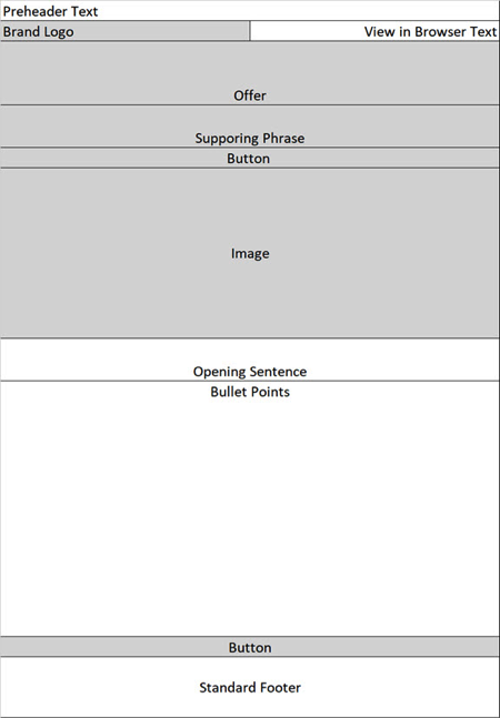
Let’s start at the top. The areas shaded in gray are all images, which means there’s a very good chance they will be blocked when the email is opened.
The offer, supporting phrase and even the button copy can easily be made rich text, so that they will be seen by the recipient even if images are blocked. So that’s our first hypothesis:
“By making the offer, supporting phrase and button copy rich text they will all be readable even with images blocked, which should increase reader engagement and boost conversion rate.”
Next let’s look at the wireframe itself. The offer is at the top, which is good. But the real meat of why the reader should buy is much further down in the bullet points. People have to scroll through a large image with no copy on it to get there.
If we were selling a visual item, like clothing, this might make sense. But what we are selling is not visual, so the bullet points are much more important here than the image. Which brings us to our second hypothesis:
“The bullet points really make the case for the purchase, more so than the image does. By moving them higher up in the wireframe they will garner more eyeballs (since people won’t have to scroll as far to see them) and should drive more sales.”
These first 2 hypotheses were driven strictly by the wireframe; they have nothing to do with copy.
When we examined the copy, we were able to develop 2 more hypotheses.
The first had to do with subject line. The control subject line, in a ‘wireframe’ format (once again, for confidentiality and to focus you on the structure, not the specific words), is "(invitation)(offer)” -- meaning there is language akin to an invitation, followed by the offer.
To come up with our test we did an analysis of all subject lines used with this product/list combination over roughly the past 15 months (2016 plus year-to-date 2017).
We turned each subject line into a ‘wireframe’ and then aggregated the results of sends using each subject line ‘wireframe’ to make it more manageable.
The control subject line ‘wireframe’ was part of the analysis – based on open and click-through rates (we didn’t have any other metrics tied to the specific sends, unfortunately) we saw that it ranked 8th of the 9 subject line wireframes used previously.
Three of the top 4 subject lines had a wireframe that started with a (transactional) phrase; think copy that seems related to an order confirmation, shipping notification or some other transaction. This led us to our third hypothesis:
“By opening the subject line with a transactional phrase, instead of an invitation, more people should be enticed to open the email and, as a result, more should end up purchasing.”
So our test subject line would be “ (transactional)(offer).
We had some other ideas for making the subject line more powerful, but decided to stop here so we could get a clear read on the transactional vs. invitation language. We also made a note that for the upcoming test the client should start tying bottom line performance back to individual sends and subject lines, so we’ll have that data to analyze going forward.
Our last hypothesis revolved around the bullet points in the email. They were very short and focused on the features of the product. This led us to our fourth hypothesis:
“By adding benefits and advantages to the features in the bullet points, a stronger case will be make for the product, which should in turn increase our conversion rate.”
Copy itself is often the most powerful tool we have to boost performance, but many marketers overlook this and focus on design and other elements. We always try to work in a copy test or two, as we’ve seen great results here in the past.
2. Creating the Test Elements
Before we think in terms of email messages, let’s take a quick look at what elements are required to test each hypothesis.
Hypothesis 1: By making the offer, supporting phrase and button copy rich text they will all be readable even with images blocked, which should increase reader engagement and boost conversion rate.
This is pretty straight-forward. Right now the offer, supporting phrase and button copy are all embedded in images. We need to remove the images and make them each rich text, matching as closely as possible the control font style and size. We will also include a shaded table behind each bit of copy, so it looks as much as possible like the control while still being rich text.
Hypothesis 2: The bullet points really make the case for the purchase, more so than the image does. By moving them higher up in the wireframe they will garner more eyeballs (since people won’t have to scroll as far to see them) and should drive more sales.
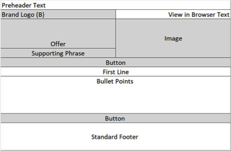
This will require a new wireframe, where we shift the bullet points higher up (less scrolling). There are a number of different ways to accomplish this; you can see how we did this in the diagram at the right above (note that nothing but the wireframe has changed; we only addressed hypothesis 2 at this point).
Hypothesis 3: By opening the subject line with a transactional phrase, instead of an invitation, more people should be enticed to open the email and, as a result, more should end up purchasing.
This one is simple; it just involves changes the initial copy of the subject line to be transactional instead of an invitation.
Hypothesis 4: By adding benefits and advantages to the features in the bullet points, a stronger case will be make for the product, which should in turn increase our conversion rate.
This is probably the most difficult to implement. In addition to putting some thought behind fleshing out the benefits and advantages to match each feature we need to get the new copy written and then approved by the client (not always a quick or easy task when you’re working with a large enterprise).
3. Developing the Test Plan
We’ve outlined our hypotheses as well as the elements we need to create to test them. Now comes the fun part; organizing them into a test plan.
At a base level, we have a six cell test:
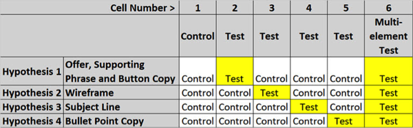
You can also perform additional multi-element tests if you have a large enough send quantity (typically you want to have at least 20,000 per cell, more if it’s a third-party list as we’re using here, since third-party lists tend to convert at a much lower rate than house lists).
In this instance we also want to test the new bullet point copy in the new wireframe as well as the new wireframe with the rich text (test) offer, supporting phrase and button copy. We feel like these are our strongest elements with the highest likelihood of boosting performance – and that testing them together will give us an exponential lift.
If you have the ability to do Taguchi multivariate testing you can test even more elements – just be sure you design the test to ensure you will get statistically significant results. And make sure that your key performance indicator (KPI) is a bottom line metric, usually something that includes revenue, not just opens or clicks.
In Closing
Curious about which cells will win? So are we; we’re hoping to get the tests out the door in June. But the point of this article was the journey, how the hypotheses, elements and test plan were developed, not the end result. So try this method with your next test and let me know how you do!
About the author

Jeanne Jennings is a recognized expert in the email marketing industry and a consultant who helps medium- to enterprise-sized organizations make their email marketing efforts more effective and more profitable.
She is Founder and Chief Strategist at Email Optimization Shop, a boutique consultancy focused on optimizing bottom-line email marketing performance with strategic testing.
She is also General Manager of the Only Influencers community of email marketing professionals and Chair of the annual Email Innovations Summit in Las Vegas.
Her client list includes B2B, B2C, government and non-profit clients including AARP, Capital One, Consumer Reports, Hasbro, Museum of Science: Boston, National Education Association (NEA), New York Times, UPS, US General Services Administration (GSA), and Verizon.
Jeanne is an adjunct professor at Georgetown University, teaching digital marketing to students earning their Masters in Integrated Marketing Communications from the School of Continuing Studies. She also leads industry as well as private workshops on email marketing topics.
Her book, The Email Marketing Kit: The Ultimate Email Marketer’s Bible, was published by SitePoint; she is a regular contributor to her own Email Optimization Shop blog as well as the Only Influencers blog.
Jeanne is based in Washington, DC, she earned her MBA from Georgetown University (Hoya Saxa!), and she is an avid hockey fan (Let’s Go Caps!).