
 How to resolve AdBlock issue?
 Tim Watson: Impactful Images

It’s well said that a picture is worth 1000 words. But what’s an impactful image?
Our brains consume visual information very quickly, making images a great way to communicate.
In fact MIT found the brain can process images seen for as little as 0.013 of a second.
I’ve run a live experiment when speaking at international conferences. I’ve flashed an image on the screen that automatically shows for 0.25 second.
As incredible as it seems when I ask the audience what they saw many got the gist of the image in that short time. It’s the same result in the different countries I’ve tested.
No wonder images are heavily used in marketing.
But what’s impactful?
An email image is impactful when it is aligned to the email message. It has to say the right 1000 words.
The purpose of images is not to make the email look nice. They need to earn the space they take.
This Red Bull creative needs little explanation. No words are needed with this image. The message is clear.
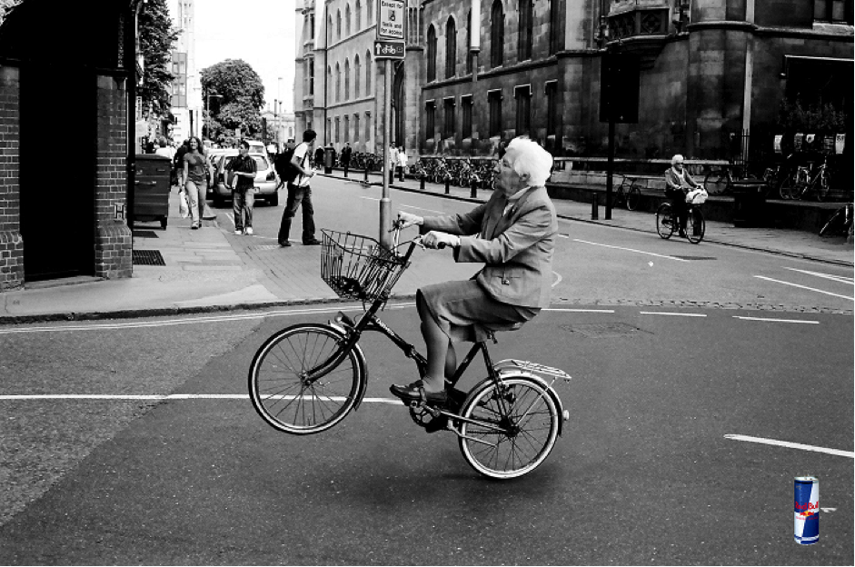
It’s impactful because it’s i) surprising ii) amusing iii) has a message.
A great image is one that contains the message.
To make that image standing use something that doesn’t quite fit with our sense of reality. Our brains are tuned to look for things that don’t fit. We quickly ignore all visual information that’s normal.
You can’t help double take with the Red Bull image. After all you don’t normally see Grandma doing bike wheelies down the road.
Or how about an ocean that you can lift?
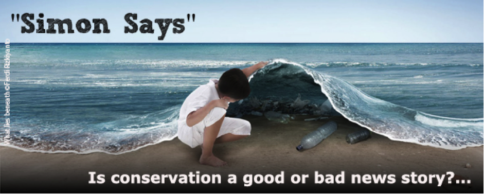
Again, the message is clear – under the surface of the ocean is a sea of plastic. The unusual and unreal makes it standout.
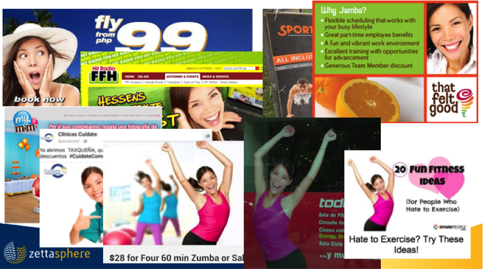
Happy smiling people are the modern-day cliché. As fast as the brain is see an image, it’s just as fast to ignore uninteresting – we ignore what we’ve seen before.
Stock photography means we are over exposed to run of the mill images. Those plastic looking stock models. And we’ve developed the ability to spot them.
They lack credibility.
If that happy person could be used by any brand just how much message does it really carry?
If you’re going to use people, make them real and authentic. That makes them credible.
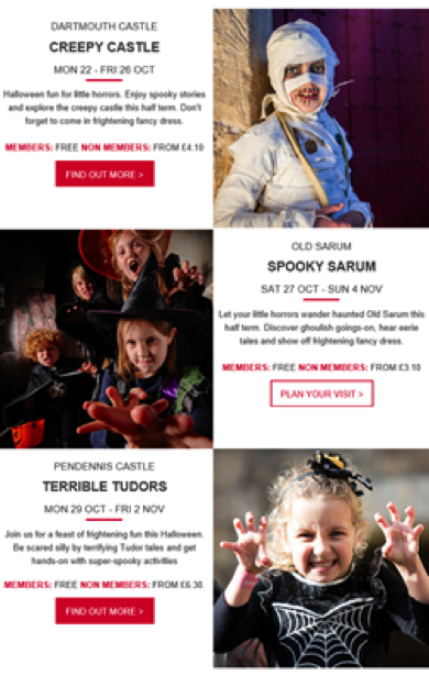
This Halloween event email promotion from English Heritage oozes authenticity.
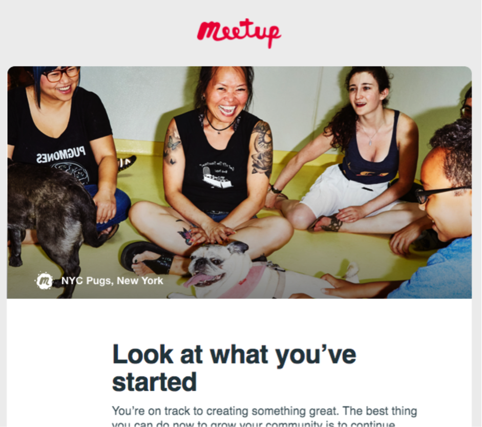
Or this authenticate email header from Meetup
Practicalities can make it hard to get away from some stock images. When you have little choice consider how you can use stock and make it your own – your own message.
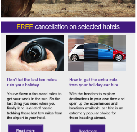
Holiday Extras could have just shown any stock car photo for their message of ‘get an extra mile’. But instead they sliced up a car, creating more standout.
Flywheel added speech bubbles to their image to make it more personal.

By contrast consider this email header:

Can you guess what that’s about? Of course you can’t!
It’s “generic business scene”. Pictures of people shaking hands go in the same bucket.
When it comes to product promotions it gets easier. If you’re selling products, it’s simple – show products. But there are still choices.
Products can be shown alone or in context of how the product is used.
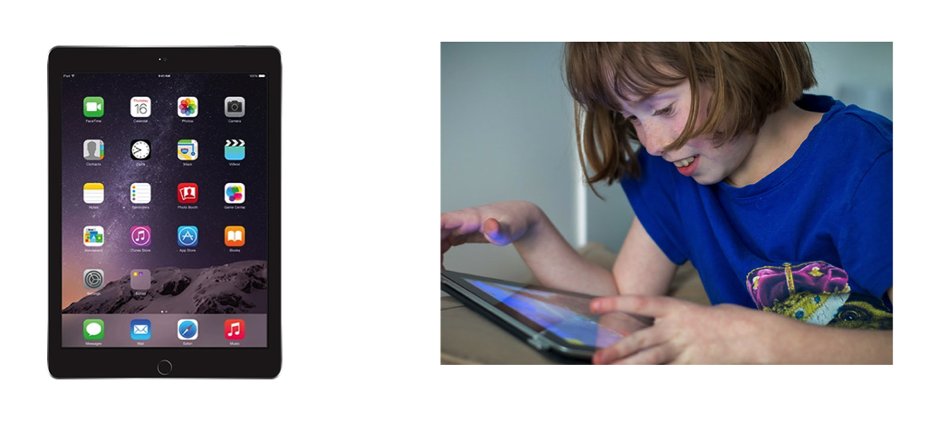
Showing products in context helps people imagine what it’s like to own the product. And that can be powerful.
The image on the right says so much more.
- It’s a portable product
- It can be used by children
- Operated with fingers
- It’s about 8” across
- It’s fun and engaging
If someone is not familiar with tablets that’s a lot of information quickly understood.
The right way to show a product depends on the product and the audience. Fashion is a great example.
Bricks and mortar fashion shops learnt a long time ago about the power of showing the context of a product, they use mannequins. Have done for years.
In the same way illustrating fashions on model helps engage the shopper.
Google’s shopping feed is optimized to make the most money for Google (shocker I know).
It sheds light on images that sell. Google puts at the top not just based on Ad bid but also on what gets clicked. High clickers are high earners for Google!
I tried searching for a black dress and got this choice:
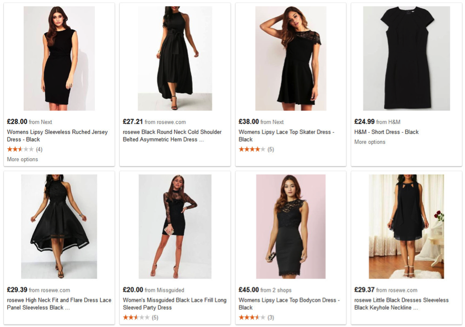
Only one dress is shown off model. Seems like a big hint as to what works.
Now some shoes to go with my black dress outfit.
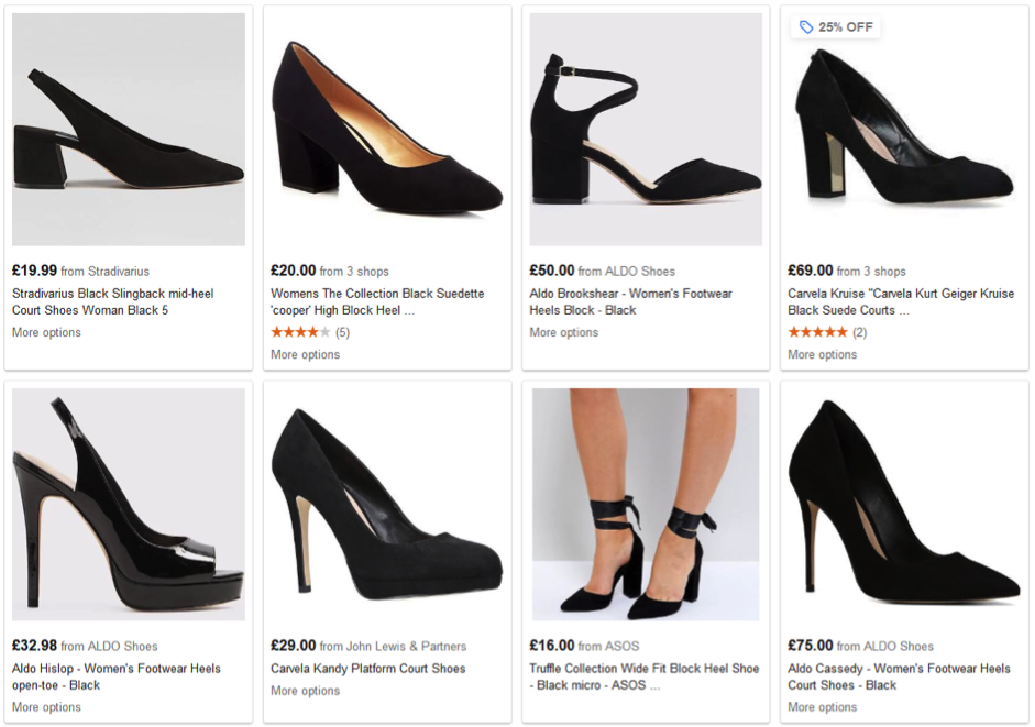
Interesting right? People don’t need to see a foot in a shoe! They are most interested in the shoe detail.
Photos are great when it comes to authenticity and believability. They’re not the only choice when it comes to email images.
Illustrations, cartoons and charts too.
These can be great to bring across a message when there is no product. Many brands develop their own illustration style, such as Airbnb.

Illustrations and cartoons give an approachable feel that are good for getting attention. And if you develop a consistent style the power builds over time.
Just because you can doesn’t mean you should.
Images are not right for every brand and every email.
Naked Wines, a UK wine club, send out almost entirely text only emails. Everyone knows what a wine bottle looks like and they all look the same. No message there.
Just because emails can be graphical doesn’t mean they should be.
Trusted Housesitters tried a text email against graphical treatment.
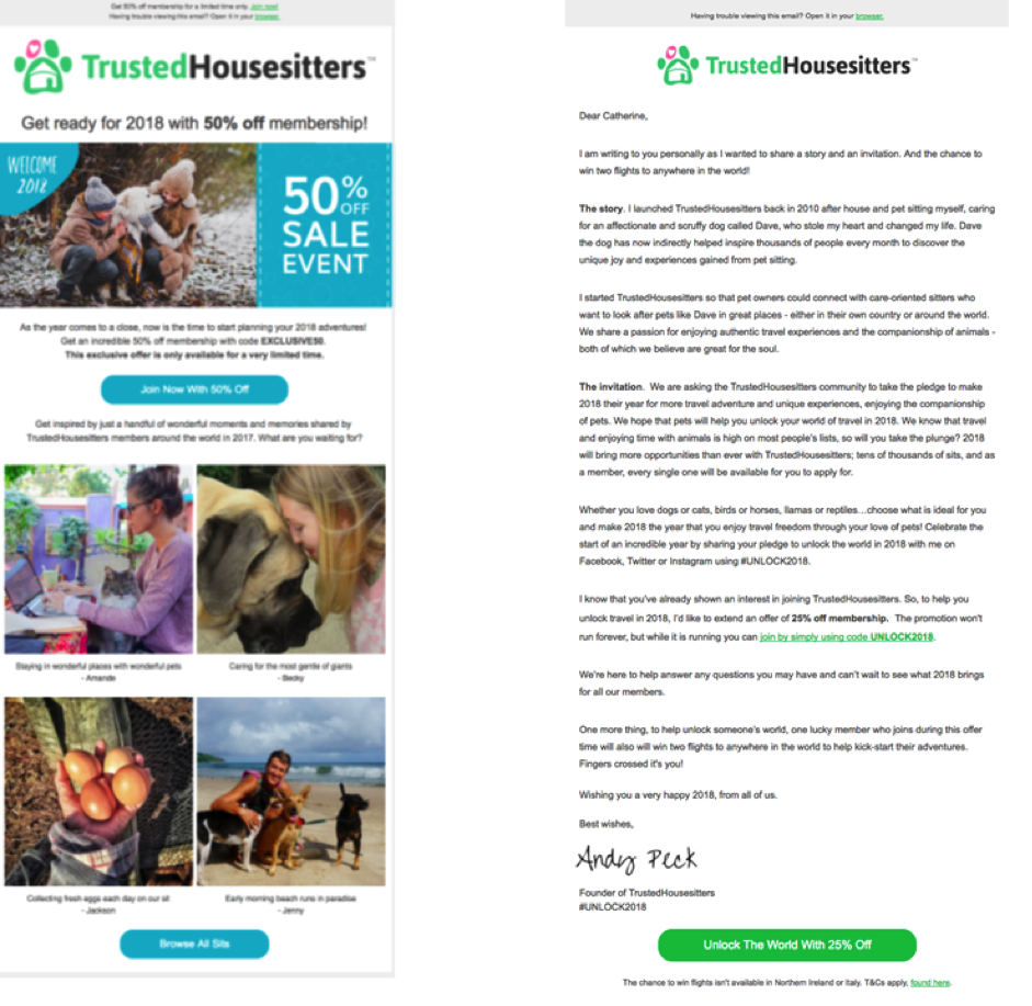
The long text email produced 560% more transactions.
And that’s not a freaky result. I’ve tested plain text, well written copy against graphical emails on several occasions. I’m quite a fan of non-graphical emails as a result!
The takeaway
Don’t feel you have to use an image to make a good email. When you do use images, they should have purpose and value. Most of all they must communicate the right message.