I got some great insights on responsive design and coding for non-techies from my colleague Luca Bellavita, a design and HTML manager for Alchemy Worx, which I shared in a recent ClickZ column. But one thing that’s been taking a lot of my head space lately is how and when to leverage responsive design and coding in unconventional ways.
"As email marketers, it's our job to get a slice of that Mother's Day pie. Let's take a look at how online retailers are promoting the holiday."
"Many companies use cause-related marketing to boost their brand image, build goodwill and create positive PR. This is widely apparent at holiday time and during October, for example, as businesses jump on the breast cancer awareness bandwagon."
"The body of knowledge on best practices for email creative has grown exponentially in the time since I started working in online in the late 1980's at Compuserve. Today there are dozens of resources for traditional and cutting edge best practices in email creative. Here are some of my favorites:"
As we start a new year, let's take a look at Christmas emails past. The 2013 holiday season was filled with promotional emails galore. Here are a few that caught my attention.
As email marketers, we cringe over what can possibly go wrong with our deployments - typos, broken images, broken links. And we lose sleep at night over the even bigger bloopers - missing or expired promo codes, products that sell out before the promotion is over, website glitches and more.
If first impressions are lasting impressions, then the welcome email is key to subscriber engagement. A welcome email - or series of emails - sets the brand tone and sets expectations of things to come.
"While our subscribers sign up for emails to save money on products/services, keep up with industry trends or simply to be entertained, those of us in the industry usually have ulterior motives when opting in to an email list. I subscribe to hundreds of emails - and to email subscription services like Milled, Mailboxr, Patroneer and The Swizzle - so I can keep swipe files on everything from copy to design to offers and more."
Influencer Anna Yeaman shares her tips on properly setting the "Viewport" for mobile messaging on the Iphone:
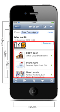
The Safari browser on the iPhone uses a 980px wide viewport. This means any layout less than 980px wide, will appear zoomed out when viewed on the web.
Do you need to go skinny for mobile? There's a huge variety of screen resolutions to design for. Putting aside fluid layouts, how wide should a fixed width email be? According to DeviceAtlas, the four most common mobile device widths are 240px, 128px, 176px and 480px wide (320px is 6th, 640 is 16th). However, when we look at the latest mobile email stats from Litmus and Return Path, the iPhone dominates.


